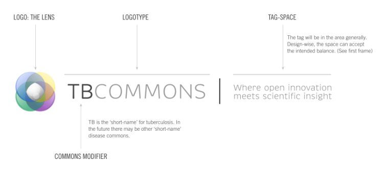
Specific: Understanding the parts of the identity and how they connect was an important factor to communicate.
General: This was a sub-brand for an initiative Lilly was attempting to launch. Helping the team see various ways that the messaging can be applied to identity creation was important and fun.

Above: The images above are variations of how to depict a lens made from many overlapping colors while still remaining to be viewed as a lens.
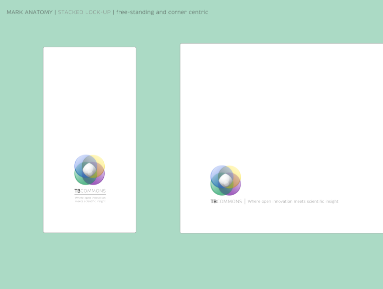
Above: Once the identity was accepted, the next plan was to test how it worked on controlled white environments and also to explore how the logo would work on non-white color spaces
