I have been a fan of word-play for along time. Over time, I have worked with writers that have inspired me to do more with words & design. I love to see how copy can say two things at once, dynamically invoking a different response in the art and the user impression. Graphically you can’t survive today without invoking some instance using flatness of flat design – I love it. I hope you enjoy this series as much as I did as I created them. Hopefully it might land me some work or employment as well.
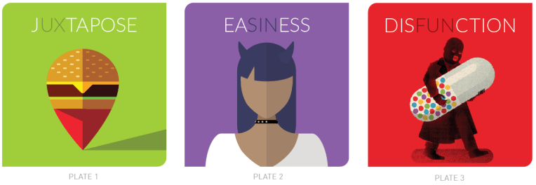
Plate 3: Disfunction:
This is the third in the series where we attempt to understand the middle ground of binary terms. (on-off, win-lose, working-nonworking, black-white) The illustration and wording is exploratory in nature. A support blog can be read for more granularity and approach.
Plate 2: Easiness:
This is a second in series of illustration campaign layouts focuses on how easy tasks will ruin your project. This illustration also has a blog with gives larger context written around the subject.
The series are also being placed in the Facebook and Twitter Ad systems with the same budget. I will add numbers as they are released.
Plate 1: Juxtapose :
UX perspective these days is a variable amount of science without design. The approach of art, design and communication project aligned to patterns of the branding layer is unique. The discovery of unique paths to human behavior is opened by using juxtaposed elements and language.
