Typically companies rely on boxes and lists to display data. This was an exploratory exercise to start an early concept of an app that would be able to help a company manage their employees usage better then Excel spreadsheets. The work-product below is shown with a balance of wire-frame and light design application.
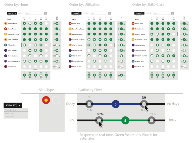
Above: One of the fundamental differences that app would have a core was the ability to show a lot of data in a tight and fluid format(s)
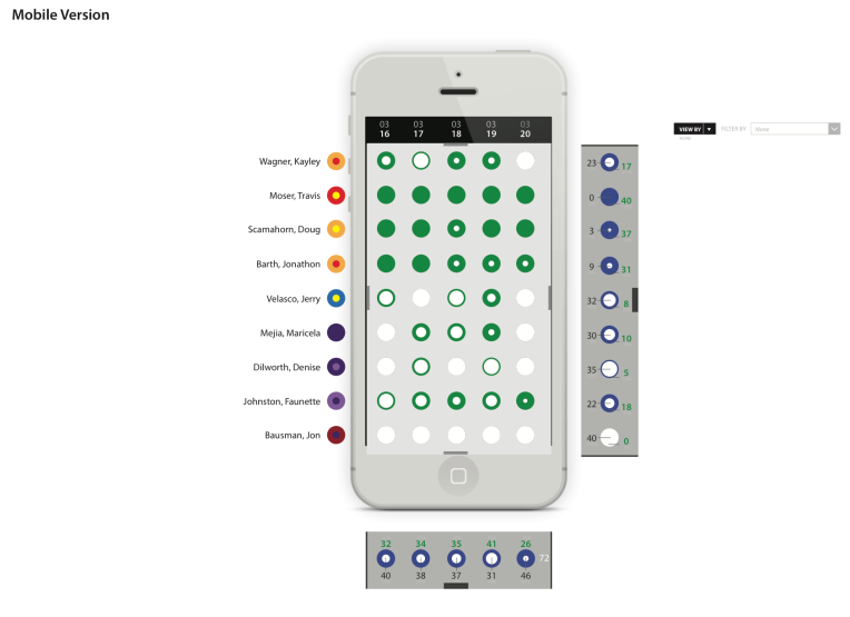
Above: The mobile version would still have the strong circular approach to show data.
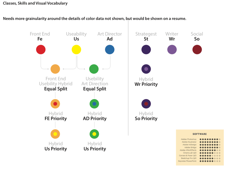
Above: Having a large amount of T-cell people made tracking and application difficult. This diagram was illustrating a system for managing individuals with multiple skills and multiple applications to new work.
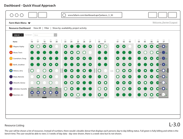
Above: The desktop version had the most room to display the data. This layout is showing how the desktop version would use the larger space available.
