Indy Design Week – May 13-17

Indy Design Week or IDW19 is pushing forth a design focus and campaign like no other event in Indianapolis. Beginning the week of May 13th, Indianapolis will host a series of city-wide events throughout the week, as well as a major line-up of speakers on its core meeting days.DzxyvhLWwAAIzlJ.jpg-large


Sentricon: Appreciated Disgust

Sentricon_web_h1.png

Above: This was the homepage with one photo from the carousel of three images. The basic layout was made to be a convergent approach to messaging from the top-down approach beginning with the homepage. One large image and one message which gets split into 3 diverse messaging channels. (Note: the social icons were not added by me in this screen shot)Sentricon_web_h2.png

Above: This is the same homepage layout showing another photo. This was an amazing differentiator to the client. The photography was from a distance insect photographer Ph.D. in Entomology; Alex Wilde. His attention to detail and beauty was amazing and unique. I licensed three amazing images for this project to give detail and beauty to something so horrible and destructive to household wood in general.Sentricon_web_m1.png

Above: The other strong and effective messaging was the ability to re-direct with objects within the site.

Below: While only one advert-tout is shown above, below you will find 3 of the full 16 of these objects. Each object had a ‘green rest state’ and a ‘purple mouseover state’. All the message objects were basically macro-projects for the website. I worked with a talented writer and roughed out a large amount of content for the website.

Sent_message_system.png

Today: This project is one my older but it is one of my favorites. And while I’d like think think the client has long moved on…I will still see these pop up every once in a while.

Drees Homes: Web Refresh

Screen Shot 2014-08-29 at 4.02.03 PM.png

Above: This layout was a new way that could be updated over time so as the website could remain fresh for a longer period of time. This was a dynamic shot with an emphasis on amenities of neighborhoods.

General: Drees was needing a better website with a gentle nudge to the future.Screen Shot 2015-01-21 at 12.18.29 AM.png

Above: One of the approaches for the design was to really push everything out to be as clean as possible. Use of typography with hinted icons to bring about specificity without clutter. leadgen_click_crop.jpg

Above: One of the most innovative approaches of effective interaction, was the use of the ‘sticky objects’. These object strategically follow the user without impeding the user journey.

contact_2.jpg

Above: Clean and neat. This is one example of a core design use and application of elegant and clean design.

Lilly Sub-Branding

tbcommons.png

Specific: Understanding the parts of the identity and how they connect was an important factor to communicate.

General: This was a sub-brand for an initiative Lilly was attempting to launch. Helping the team see various ways that the messaging can be applied to identity creation was important and fun.

center_studies.jpg

Above: The images above are variations of how to depict a lens made from many overlapping colors while still remaining to be viewed as a lens.

center_studies.jpg

Screen Shot 2012-12-27 at 3.50.27 PM.png

Above: Once the identity was accepted, the next plan was to test how it worked on controlled white environments and also to explore how the logo would work on non-white color spaces

Lilly Nasa Patch Concept

Screen Shot 2016-12-05 at 11.05.14 AM.png

Specific: This is one of the many versions of the patch the Lilly Marketing team was looking to use for 2016 launch into space .

General: This project represented a small but aggressive collaborative approach to create art and design concepts. Lilly had gotten space with NASA and cases to have a number of space experiments to go up in the next rocket launch. In the end of the project, the collaborative work was so great, Lilly Marketing chose final 4 patch designs.

Other work: Final patch product design.

Lilly Banner Ad Development


white_ads.png

Specific: These layouts are one of the many iterations to visually check that the brand is being accurately depicted as well as maintaining brand rules within a very fluid environment of the banner placement networks.

General: Lilly was moving with a very aggressive deadline for a multi-agency global campaign. At the time the banner ad networks were moving away from Flash banners and replacing them with html, css, online fonts, etc.

Other Projects:

Lilly Congress iPad App

lilly_congress.png

Specific: This screen was to demonstrate that the iPad App would be able to protect users and flow while maintaining legal application of the content.

Proprietary: Most project has a academic track for handing UX flow and Brand Application. Being a Interactive Art Director means Jerry could do both as the same time. This saved time and budget for this project.

General: Lilly is always traveling the world to share and promote education. This project was a iPad app which was to aid in their travels to large showcase Congress Events. This image depicts UX/UI as well as brand usage guidelines within the application.

Other Projects: None.


enosiX: Quick Work Quickly

eX_runner.png

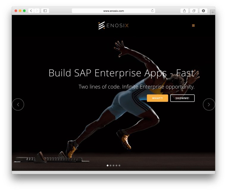
Specific: Obviously a beautiful shot used with the expressed purpose to show the pent up energy of a runner as it directly relates to SAP applications.

ex_middleware.png

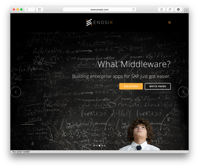
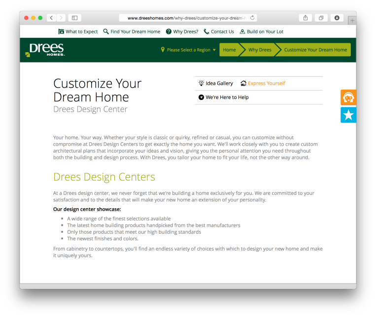
Above: The challenge to enosiX was to engage in the large market of ‘middleware’. This pages purpose is to immediately connect and engage the user. The image was chosen as it relates to complexity and simplicity at the same time. Slightly on the cliche but impactful for the question at hand.

Related Projects: Stock Purchasing for responsive web design and Retina applications.

ex_experience.png

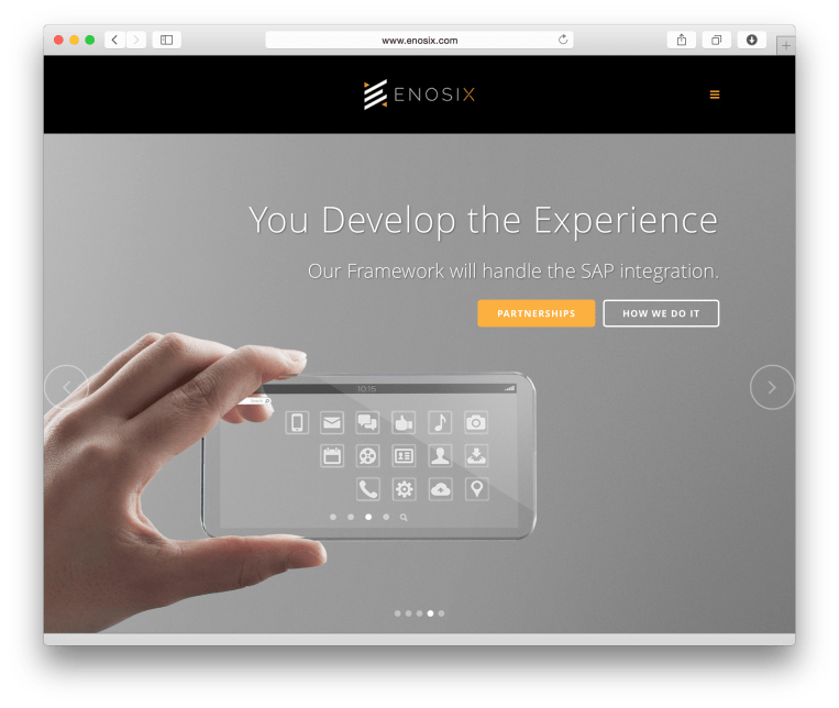
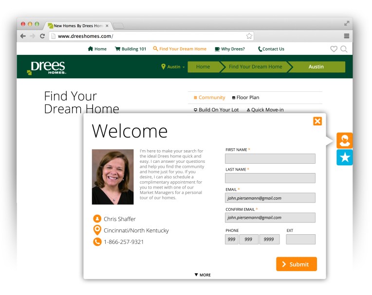
Above: enosiX had a high appreciation for professionally created photography with an artistic approach. Our content team really wanted a single message but also a layered duality and two options for user engagement buttons. The challenge was to be able to find an image that satisfied both our client and supported the message while maintaining a good presence responsive design layouts.

Related Projects: Stock Purchasing for responsive web design and Retina applications.

eX_clean.png

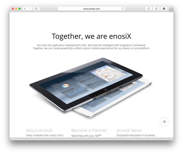
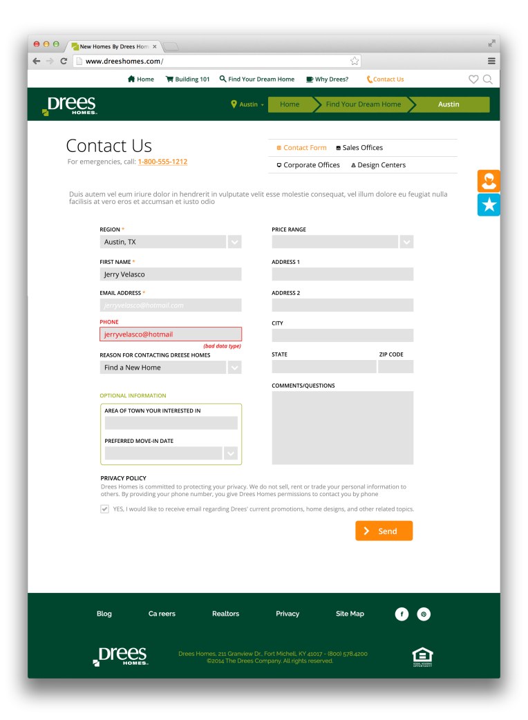
Above: The software was still in production but we had to show parts of it in certain context of the copy being used on certain pages. Taking a cue from Apple, we kept a very clean approach displaying a layout of their software.

Related Projects: Stock Purchasing for responsive web design and Retina applications.

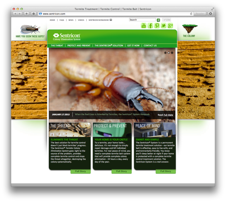
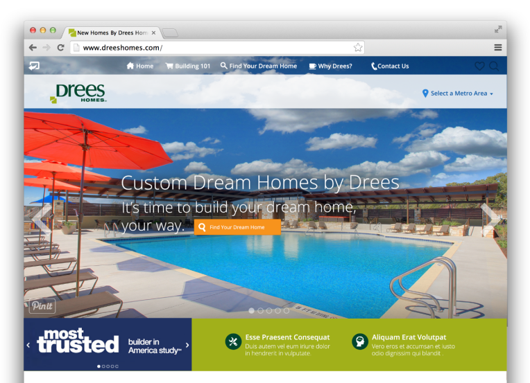
General: This project was a quick website for a start-up client enosiX (http://www.enosix.com). My role was to steward the young-client’s brand in a very fast paced production time-line. Skills used in the piece where the following: Media Assett Mangagment, photo direction, photo editing.

Related Projects: Stock Purchasing for responsive web design and Retina applications.