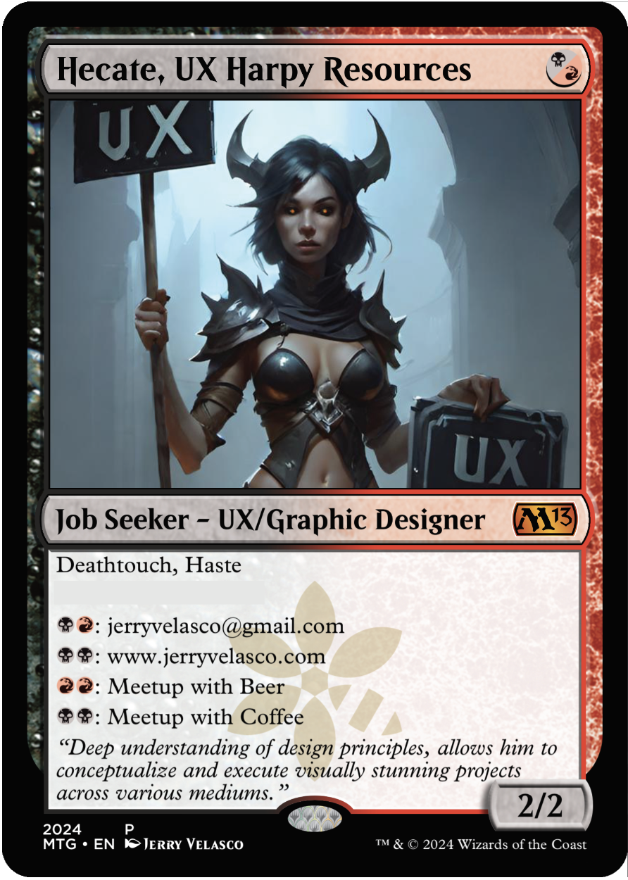
OVERALL: I had fun with the name swapping ‘Human Resources’ with ‘Harpy Resources’. Hecate is one of the top 10 popular female demon names. This UX directional is from the spicy side of AI production. Typically for this project, I did no photoshopping but on this image, I did have to fix the eyes. This card is from the UX Design series called ‘UX Directionals’. These were created to show the focus of UX by having a fantasy character hold a UX sign. I didn’t note this earlier, but the ‘leave behind’ series also is differentiated by my logo where magic ‘faction’ watermark resides on normal Magic cards. My logo on a green background is on the back (see image below).
(NEW) AI IMAGERY: The lighting is good and the mood was dark and scary. The overall color palette is bluish avoiding any warm colors at all. The figure is somewhat attractive and scary at the same time. The figure is adorned in light-pointed-battle-armor. The horns are a bonus – really made a good impression by contrasting with the lighter part of the background. The signage is odd and the fonts don’t match but double-pumping UX is helpful for leave-behind material. AI prompting is somewhat experimental and a journey of finding the image you want. I was impressed with the overall composition amongst the 30+ image renders.
GAME ATTRIBUTES: This card wasn’t design to be played – it was to be used as a business card during the event. I wouldn’t recommend playing this card but if you had to, this would be a 2/2 creature with death touch and haste. It would be a good 1 mana play on turn 1. The in-game mana abilities wouldn’t help during the game at all unless you were playing me and I might have to leave to meet with you during a game and lose the game out of forfeit.
OVERALL: This is from the UX Design series called ‘UX Directionals’. These were created to show the focus of UX by having a fantasy character hold a UX sign. There was some spicy cards and some less-spicy cards – this was one of the less-spicy images as the figure is completely covered in armor. Syr is a knight pre-fix neuter version Sir. Creature is me, the job seeker UX Designer / Graphic Designer. As of this post, I am still seeking employment.
[I’m adding a new section below as it will be the differentiating factor of the leave-behind cards. The game attributes won’t change from card to card.]
AI IMAGERY: AI prompting is somewhat experimental and a journey of finding the image you want. I was impressed with this composition. The lighting is good and the mood was dark and scary. The highlights on the armor indicate a small village of perhaps a fire near the figure. The sign shape had a fantasy shape with sharp edges. Knights are considered good agents generally, however this one appears more of a dark nature. The silhouette creates a good number of sharp edges to the armor. The UX font color was red which aligned to the color identity of the card itself.
GAME ATTRIBUTES: This card wasn’t design to be played – it was to be used as a business card during the event. I wouldn’t recommend playing this card but if you had to, this would be a 2/2 creature with death touch and haste. It would be a good 1 mana play on turn 1. The in-game mana abilities wouldn’t help during the game at all unless you were playing me and I might have to leave to meet with you during a game and lose the game out of forfeit.
OVERALL: I wanted to be able to have cards that I could hand out at the event. This magic card is basically a business card with use for mana-based connection possibilities. I found a listing of the most popular demon names and applied a unique name to the card. Some are more spicy than others, so I had to make a set of non-spice for each spicy version – I didn’t want to offend anyone.
GAME ATTRIBUTES: None intended, but it can run in a game as a 2/2 creature with deathtouch and haste.
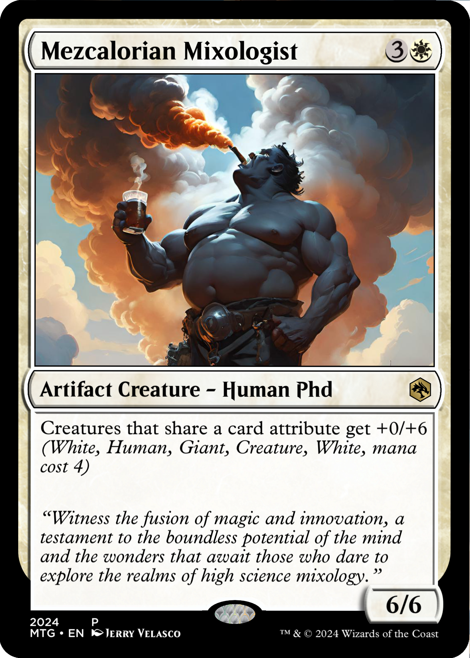
OVERALL: This is a second iteration of the Mixologist card. I couldn’t pick between the two final images, both images conveyed the huge smokey flavor of Mezcal. This card was added to represent my brother-in-law. He is one of the only people I know who has a large knowledge base of Mezcal. If you’re lucky, at night he might have an impromptu tasting from his most beloved top-shelf Mezcals. If you’ve not tasted Mezcal, try it sometime – It’s unique and there is a large range of flavors – it has a distinct smoky flavor. Most mezcals taste differently than their aroma – expect the unexpected. Mezcal’s flavor is highly dependent on its artisanal production methods and the specific environment where the agave plants are cultivated, making each bottle a unique tasting experience. His favorite mezcal drink is called the ‘Better than Jerry’ which basically my favorite Tequila drink of Tequila, Club Soda and 2 lime wedges – He uses Mezcal instead of Tequila.
GAME ATTRIBUTES: Like my brother-in-law, this card loves to share what it has – Here, it’s the base defense with other like creatures. This takes on the mono-white position and is a large ground creature. As white is often, it’s overpowered as this card shares a 0/6 attribute with other creatures which might share its attributes. A tiny white 1/1 bird will now be a 1/7 flying bird as long as this card is on the battlefield.
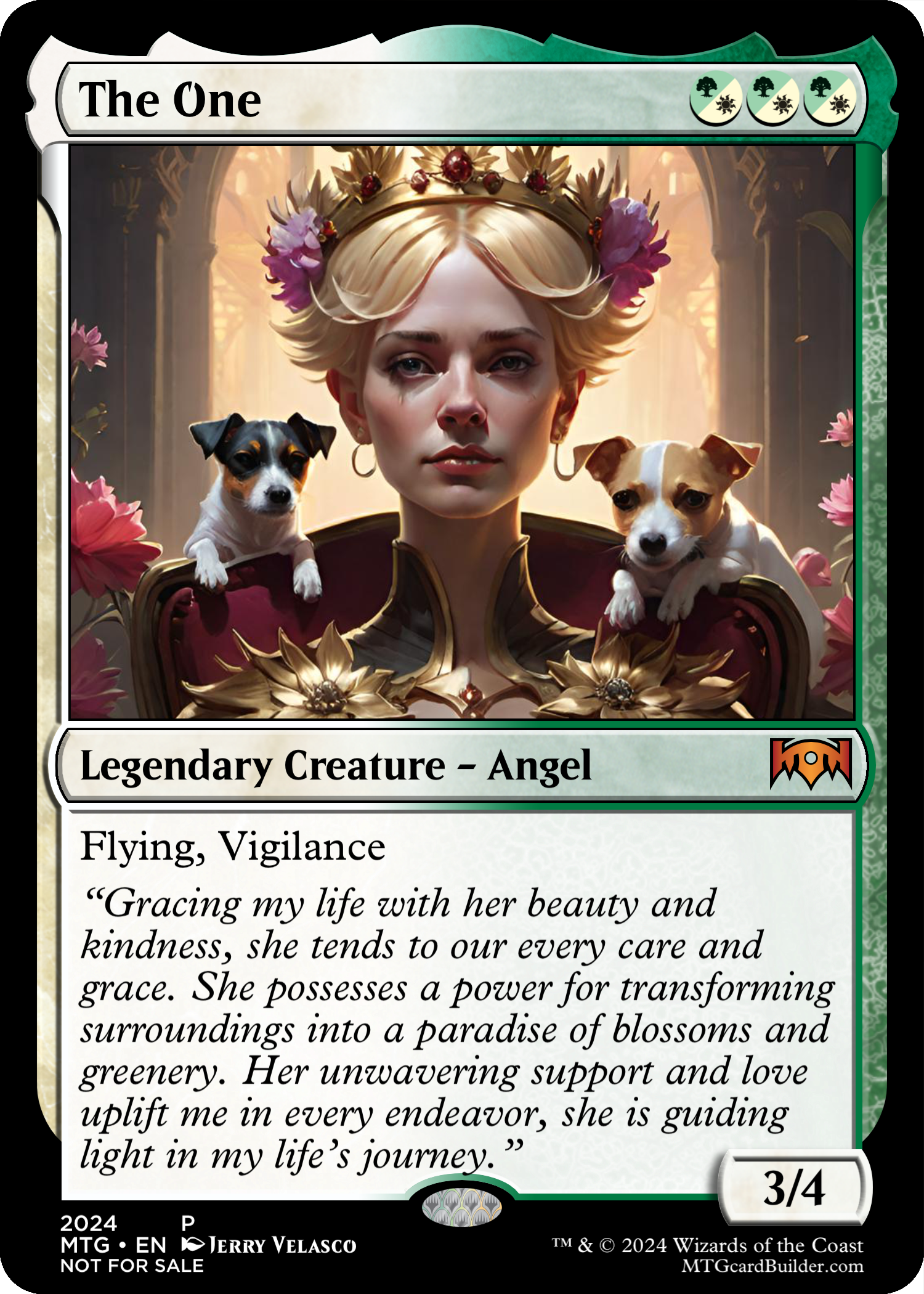
NEVER FORGOTTEN: Perhaps I originally forgot my wife from my artwork, but I didn’t let that end there. Today I released a limited edition card just for her. The flavor text says it all. She was very pleased with the card and I expect a foil-version of the card to be printed and arrive next week. AND when my piece doesn’t sell ($2,000.00 – If it does sell, I will be shocked), and returns to me, this card will be replace one of the duplicates. I haven’t revealed the full piece but we have 1 more week.
BACKGROUND: My wife loves dogs, flowers and gardening in general. She is truly a grower of all things, including me.
Happy Mothers Day for the women (and other people) who have supported and brought forth new life into our challenging and shifting world so that hope will shine eternally in our hearts.
In any art show where works are displayed, it’s essential to provide background information about the piece you’re viewing. A statement adds depth to the viewer’s understanding, enabling them to suspend or support their judgment more effectively.
Before you form judgments based on the media frenzy surrounding AI and AI generative imagery (AIGI) creation, I urge you to hear me out. I’ve thoroughly considered the subject and its role in my work and have taken great care to explain it below. I meant for this post to be a short post, but its gotten longer and I can’t seem to disconnect all the logic and writing without removing deep meaning to it all.
BEFORE MY PIECE: I had judged AIGI as negative and damaging to the arts and looked away and ignored AIGI. I also believed algorithms could NOT create imagery that competes with human artwork.
RESEARCH & INPUTS: It was clear I was going to need to explore the current status of AIGI. Besides reading a large amount of articles, I joined two opposing Facebook groups on AIGI to see what people in communities are saying.
1) One group was pro-AIGI and its channel is devoted to people who talk less and produce more. A lot of the posts are amazing and beautiful images, “AI Revolution – MidJourney AI, DALL-E 2, Stable Diffusion” – This group has 234k members. There is not any writing as much as showing images created by AIGI.
2) The other group, “Artists Against Generative AI ” which frequently post anti-AIGI content – This group has 98.4k members. I have learned a lot from both groups. One pushes hard and demonstrates work produced by AI and the other group tears down the AI and post real-world damage to artists and art.
HOW DOES AIGI WORK? I didn’t conduct deep research in this area but I’m sure its the image sampling inputs at the heart of controversy. (See image below)
RESEARCHING SOFTWARE: I was going to need to play with AIGI and see what it was all about. How are others making imagery? What software or online platforms do I use? Is it free or does it cost money? How much does it cost. I’m not going to pay for something I don’t understand or can see what it can do. I can’t do explore without a project or parameters and I didn’t want to read about it and regurgitate what I read from other people. This subject will most likely be its own post eventually.
PLANNING: To give my project a personal stake, I had to make it close to home and fun. Being a huge Magic the Gathering nerd, I decided to set the magic card as the format. Each card has art and text – it’s going to perfect. I also have a secret dream to be a magic card creator. (I took a test to become an intern for Wizards of the Coast and didn’t make it in. Out of 2000 test applicants, 2 people had perfect scores – Good bye dream!) To make it personal, I needed a reason for each card. I had some thinking to consider – Should I make one large format card? or should I make several actual cards? After some experimentation and testing, I decided to make cards based on my attributes in life. That went far, but it wasn’t enough since our lives are shaped by other people in our lives. – I began to widen the scope by adding other people as card stories. How many cards make a great story?
MY ROLE: Since I’m not producing the images or the text but I am directing someone/something else to produce work, My role was similar to an Art Director more than a singular artist. I was instructing others what and how to write / illustrate based on my project parameters.
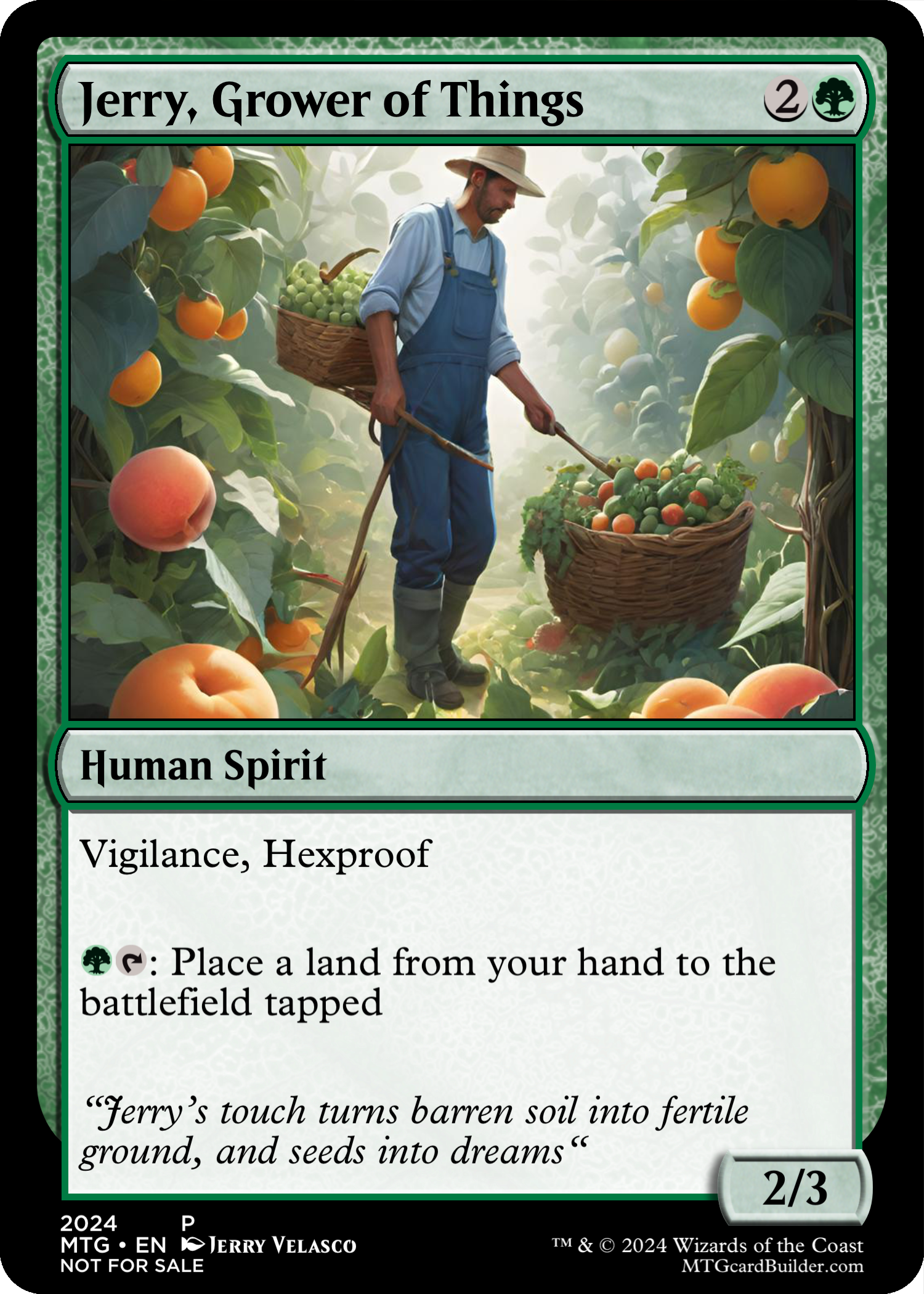
CARD TEXT & STRUCTURE: Each card would be considered a ‘story block’. I first made a listing of 30+ card ideas knowing many of them will not make into the piece. I started with the basics, Title, Color type, Card attributes, flavor text and imagery description. (see Magic Card attributes) I chose the title and asked ChatGPT to write the flavor text. Sometimes the writing didn’t support the title and I re-wrote the title to focus the output text. I learned a lot about ChatGPT. I was really surprised that ChatGPT even knew what flavor-text on a magic card was. I asked for writing several times, once I was satisfied with the text, I moved on to image creation. Below is the text for card #4 or “Jerry, the Grower of Things.”
IMAGE CREATION & TRASH: After researching all the free AIGI applications, I found one that would produce imagery that looked professional, not photographic and somewhat illustrative in nature. This is where I learned about prompting the AIGI software. Prompting is similar to coding but regular English words – I am still not a master but I could get images to be produced to my liking. After producing 50-100 images, I would rank every image based on detail, imagery and composition. Every final image in each card took the making of 60+ images unusable for various odd reasons. Some images didn’t complete due to rules of imagery.
SURPRISE & FASCINATION: While on each prompting expedition, my goal was to be looking for the closest output of my prompts. I was also having fun in some regards to how the software would interpret some of my prompts and show me images that were actually better directions than the one I was pushing for. One day I will share the trash but that is another post or another piece to produce?
GRAPHIC PRODUCTION: Now that I had all the building blocks, I still had to assemble the card (See Attributes) and some details that I didn’t plan for that make a magic card a real magic card. Each card needed to look like a legitimate and playable magic card.
FINAL CARD WORK: Below is the final version of ‘Jerry, Grower of Things’ 4 of 28 cards. Now you have seen 1/28th of the final piece.
LAST THOUGHTS: Not sure how my piece would be accepted by other ‘artists’ at the one piece show. My assumptions were: 1) I expected was other artists at the show to hate my work since it was using AIGI. 2) I also thought some people might feel left out from my story. I only had 28 cards, I definitely have more than 28 people to include in the piece. In the end, I was exploring within a timeline and was probably sloppy and insensitive to leave out people are in my life and should be in the piece. What could go wrong? One person did speak up – my wife. I hurt my wife badly for not having her as a card in my show. It hurt me that she would take to heart and be hurt so deep. I love my wife so much – she is the grounding element of love in my life – It was not my intent to hurt anyone, especially her. I hope to find a way to fix this in both our hearts.
Yesterday, while browsing Facebook, I stumbled upon a quote from one of the crew members who were installing the artwork in the Schwitzer Gallery.
Certainly, while this exhibit will be available for 1-2 months, tonight offers a unique opportunity to meet the artists in person, engage in discussions about their pieces, and potentially acquire some exceptional artwork.
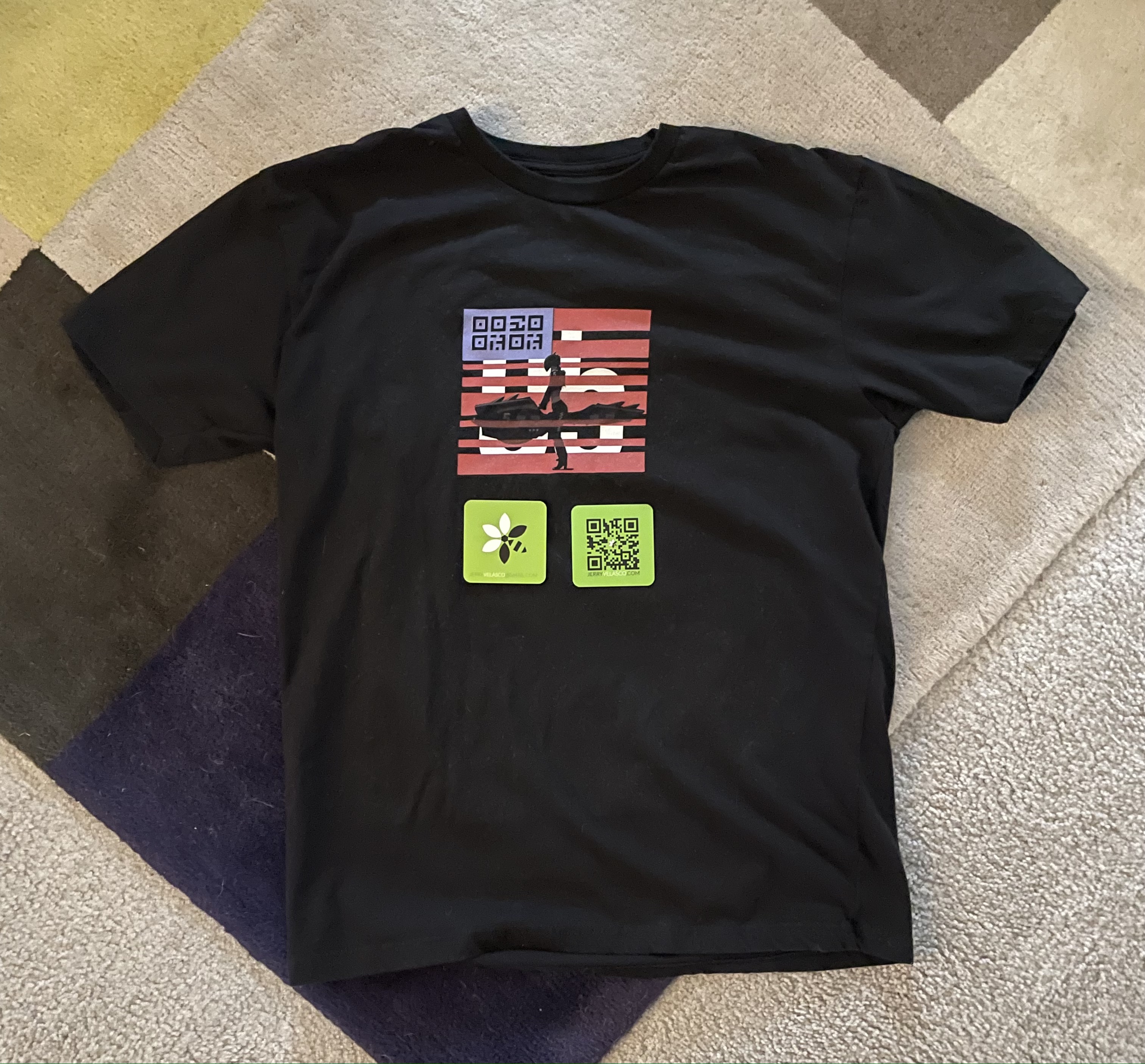
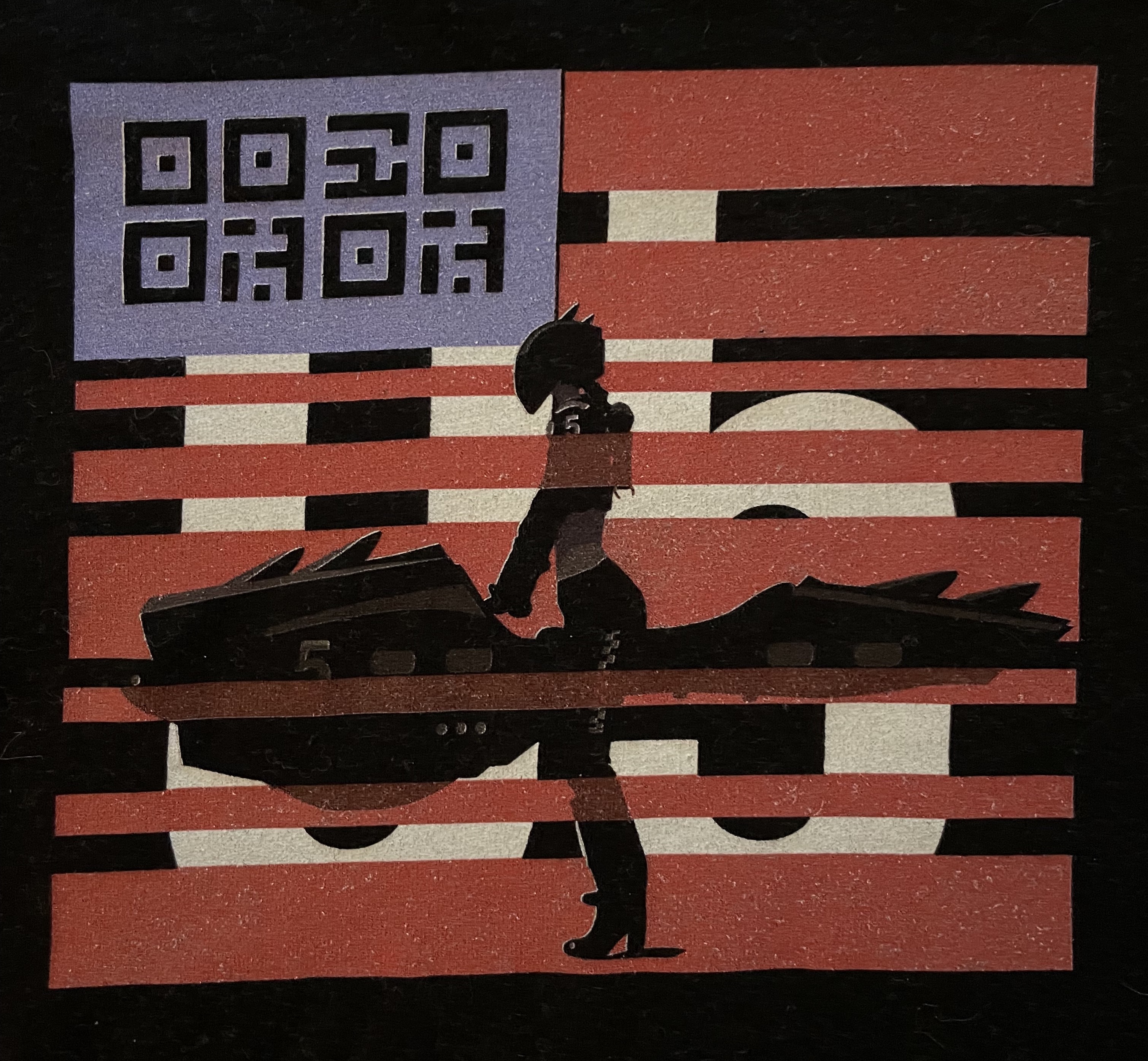
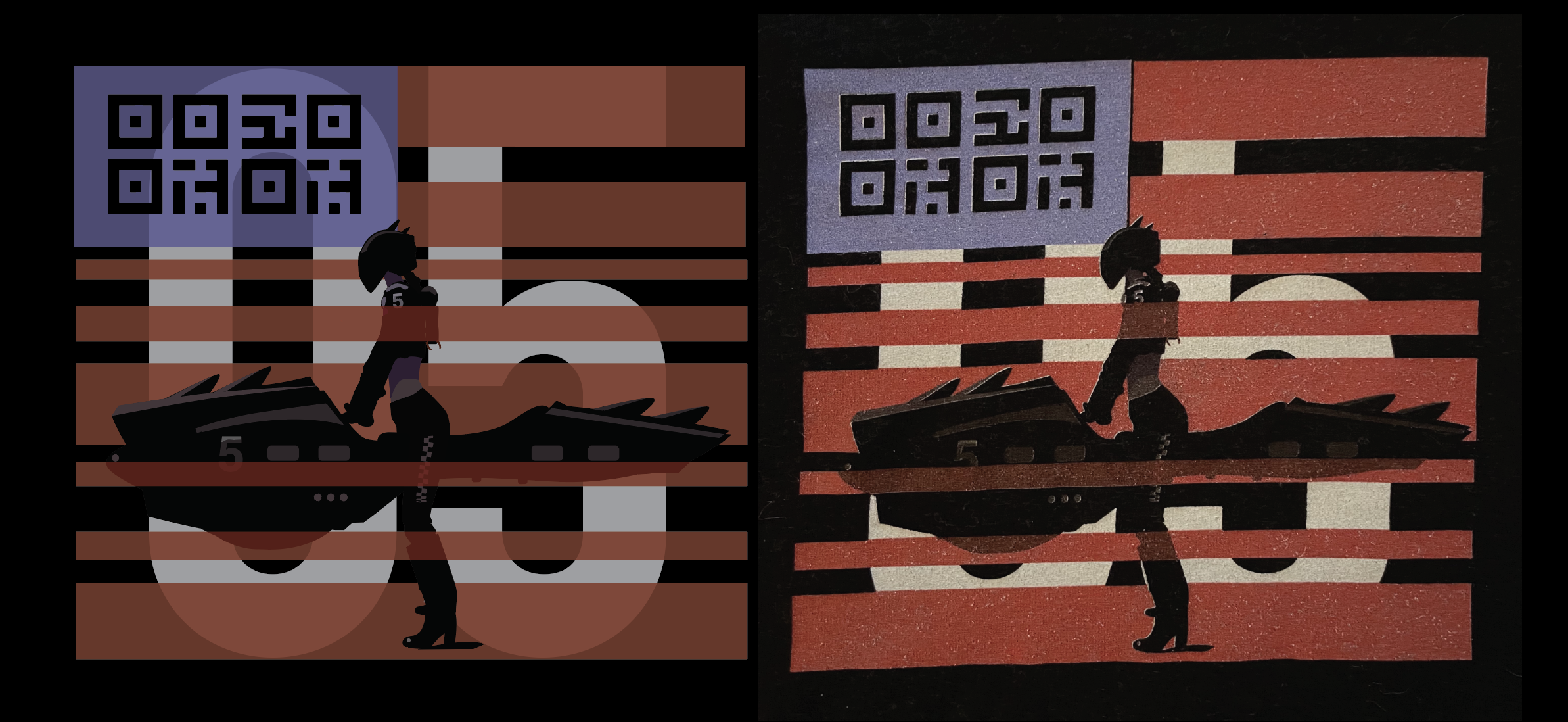
This is the final shirt design. It isn’t a sneak peak, as it’s the actual illustration on a shirt that I was going to wear on opening night. This shirt design was interesting since the transparency layering colors didn’t get translated very well. I don’t blame StickerMule. In hindsight, I should have broken the color blocks with actual colors instead of transparencies. I may try another shirt to see if I can fix the transparency colors. This will be the second to last post. The last post is going to give a glimpse into the greater concept of Roost-Haven.
(above: Shirt output from StickerMule)
(Above: Side by side comparison of design and shirt output)