Syr Velasco, UX Champion

OVERALL: This card is from a set of directional series called ‘UX Directionals’. Where the main figure is holding signage.

(NEW) AI IMAGERY: This image was chosen for the overall dark elements. The typical iconic knight is shrouded in darkness and dark metal armor. The figure is facing away from us showing their backside. The silhouette wonderfully depicts the sharp outlines of the armor. Armor highlights hint of a well lit canopy. The background is odd being it has some indoor/outdoor elements. There is a hint of a fire light in the lower right corner and warm highlights on the lower-right area of the knight. The signage design appears custom made for the armor. The UX font and color are the color-cool elements in the composition making it stand out amongst the overall gloomy composition.

Lamia, Hiring Manager

OVERALL: The name Lamia came from an internet search of top popular demon names. This card is from a parallel set of directional series called ‘Jerry Directionals’. This set was similar to UX directionals but the signage was my name instead of UX.

(NEW) AI IMAGERY: Overall great composition with a lot of subtle work going on. The figure and the sign compete for attention in this layout. The AI created the Jerry Sign really huge, more like a billboard. The font for Jerry was crazy and odd. Its seems to have created each letter separately – look at the two R’s. The structure of the sign is very dark yet Flintstone in design. The color-choice of red for the lettering makes Jerry really stand out. The background is outside and lighter than the other dark forest imagery created by AI. The figure has no armor but appears to have razor sharp Demi-gaunts. The figures hair is swooping not sure if it’s wind or scary magical hair that will kill me. The figure is also holding large dagger which is cropped out.

Naamah, Hiring Manager

OVERALL: The name Naamah came from an internet search of top popular demon names. This card is from a parallel set of directional series called ‘Jerry Directionals’. This set was similar to UX directionals but the signage was my name instead of UX. 

(NEW) AI IMAGERY: Background is great – blueish, dark forest, very gloomy with a small amount of warm lighting on the bottom left to indicate a fire nearby. The backlighting gives contrast to the figure and really defines the edges to the figure and the signage. The glowing eyes of the warlock make the scene complete. The crazy ornamentation of the sign is really cool visually by the somewhat spiky and organic sign design. The font is crazy weird and looks like magic created it. Overall a really nice composition for a leave-behind card.

Syr Velasco, UX Champion

OVERALL: This card is from the UX Design series called ‘UX Directionals’.

(NEW) AI IMAGERY: This composition made it to the ‘print round’ due to the fact that the figure is a traditional white Paladin. The figure is iconic and makes for a solid fantasy position in imagery. Great traditional image to hand out as a business card. The light and shiny armor with gold trim work well for executive security for high government officials. The sign is bright with black UX lettering. The background is placed inside a castle or church. The shadowing is great and cuts the paladin down the middle.

Agrat Bat Mahlat, Head hunter

OVERALL: This card is from the UX Design series called ‘UX Directionals’. The name came from the top 10 female demon names. One of the spicier versions. Impractical female-battle-armor. I didn’t note this earlier, but the ‘leave behind’ series also is differentiated by my logo where magic ‘faction’ watermark resides on normal Magic cards. My logo on a green background is on the back (see image below).

(NEW) AI IMAGERY: The AI prompt was a ‘dark paladin surrounded by flames’. The UX sign is more of a metal-type of sign held by the figure. I like how the sign’s UX appears to be cut out and you can see flames showing through the lettering. The flames are well-created and add a sinister and magical fire damage ability of the figure. There are hand issues, but overall the composition was deemed good and usable.

Cute and Stupid

OVERALL: Not the actual name of the card, but towards the end of the AI Imagery section, it became clear the name should have been something besides Syr Velasco, Waypoint Advisor. This card is from the UX Design series called ‘UX Directionals’. This is the non-spicy kinda moppy me version. No sexy armor, just a dude in a hood peddling his credentials. I didn’t note this earlier, but the ‘leave behind’ series also is differentiated by my logo where magic ‘faction’ watermark resides on normal Magic cards. My logo on a green background is on the back (see image below).

(NEW) AI IMAGERY: When the AI tool first showed me this image, I was totally thinking it was not selling point to show some dude in a rain-poncho with a sign. Something stuck about how plain and lackluster the image was. This was the very lowest G version of all the imagery – no fashionable sexy combat armor – no boob-armor adorned warlock characters at all. – Just a dude in a hand-made unadorned rain poncho holding a QR code sign pointing with an arrow at his sorry self in the middle of dark and dank forest. If any image represented me visually in my quest for employment, it would be this image. The AI put another X in UX which I found kinda cute and stupid at the same time – like my current situation…cute and stupid. In hindsight, that should have been the name of the card….’Cute and Stupid’ … lol. There is a UXX which is the User Experience Experience which focuses on UX practitioners and how there life and experience is viewed.

Eisheth Zenunim, Jerry’s Rep

OVERALL: This card is from the UX Design series called ‘UX Directionals’. Based on the image, this card had two versions based on QR code location. These were created to show the focus of UX by having a fantasy character hold a UX sign. I didn’t note this earlier, but the ‘leave behind’ series also is differentiated by my logo where magic ‘faction’ watermark resides on normal Magic cards. My logo on a green background is on the back (see image below).

(NEW) AI IMAGERY: Double card variants! I really liked both of the layouts and ended up printed both. The signage in both versions produced by the AI is really interesting. This AI produced imagery giving the figure two sign objects. I added a QR code the the tablet. The overall composition is remarkable in how all the objects float well in the given small space. I needed a QR space and the extra ‘signage object’ worked well. Even with the distorted QR code, it still works. Most notable is the highlights on the figure suggesting there is a good amount of moonlight off-scene. The ‘fashionable armor’ while impractical for close combat, does have an interesting construction from a compositional viewpoint. As for armor engineering in medieval skirmishes we may want something better however, I’m assuming if you were wearing this armor, you’d have some mystical advantage which would stop most opponents from getting very close.

Experience Tactician

OVERALL: This card was 1 of 2 which were printed on ‘metal’ instead of paper. While this card was designed for the handout series, it was not intended to be given away, instead the potential meetup would scan the QR code. This card is from the UX Design series called ‘UX Directionals’. These were created to show the focus of UX by having a fantasy character hold a UX sign. I didn’t note this earlier, but the ‘leave behind’ series also is differentiated by my logo where magic ‘faction’ watermark resides on normal Magic cards. My logo on a green background is on the back (see image below).

(NEW) AI IMAGERY: This image conveys the sour and desperate methods in which looking for a job is such a horrible process. The grim corpse-like figure holding up the link to their resume or website peddling his want for employment on the street. What a pathetic existence this poor fellow must have in his life. When will he hear back from any anyone? The sunken frowning face depicts the pain and sorrow associated with rejection in a process that offers no reasons for the situation he is now a part of.

Hecate, UX Harpy Resources

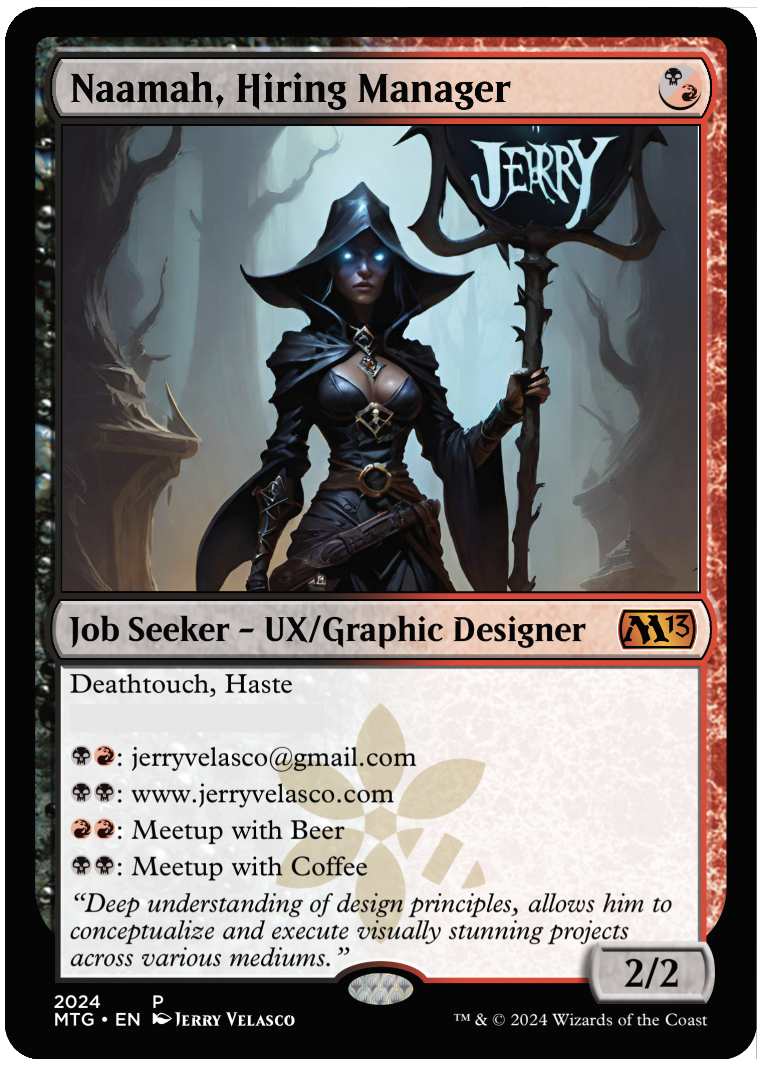
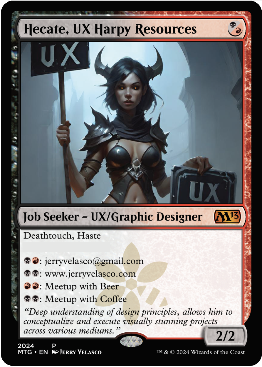
OVERALL: I had fun with the name swapping ‘Human Resources’ with ‘Harpy Resources’. Hecate is one of the top 10 popular female demon names. This UX directional is from the spicy side of AI production. Typically for this project, I did no photoshopping but on this image, I did have to fix the eyes. This card is from the UX Design series called ‘UX Directionals’. These were created to show the focus of UX by having a fantasy character hold a UX sign. I didn’t note this earlier, but the ‘leave behind’ series also is differentiated by my logo where magic ‘faction’ watermark resides on normal Magic cards. My logo on a green background is on the back (see image below).

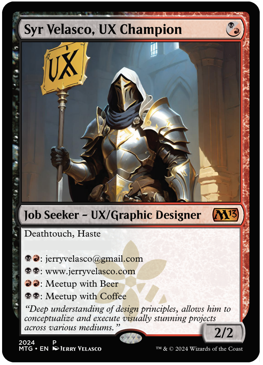
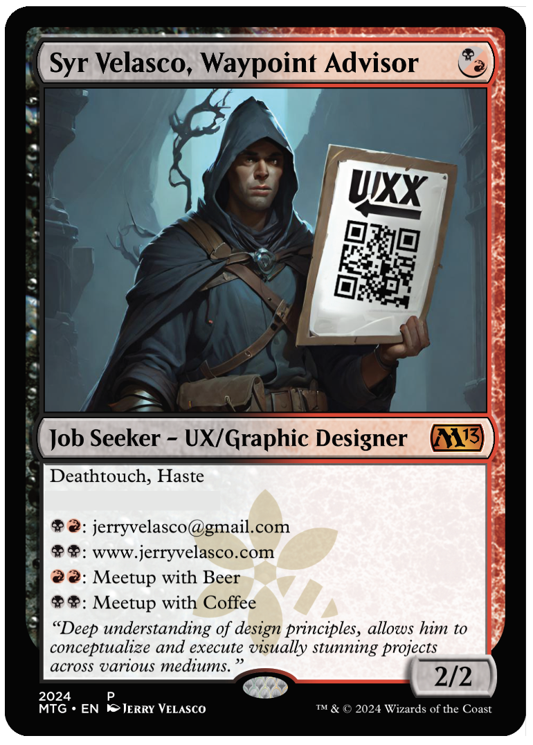
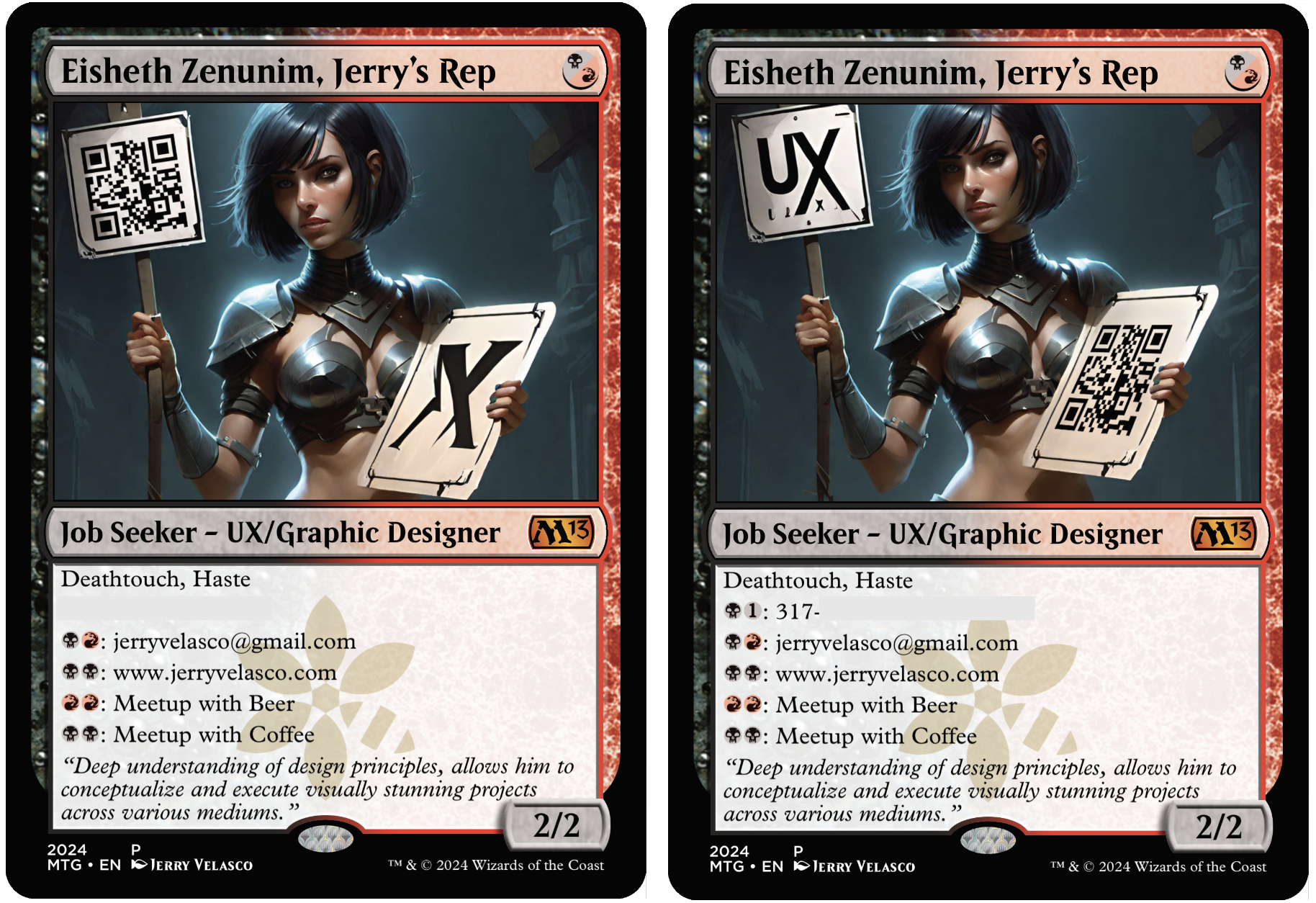
(NEW) AI IMAGERY: The lighting is good and the mood was dark and scary. The overall color palette is bluish avoiding any warm colors at all. The figure is somewhat attractive and scary at the same time. The figure is adorned in light-pointed-battle-armor. The horns are a bonus – really made a good impression by contrasting with the lighter part of the background. The signage is odd and the fonts don’t match but double-pumping UX is helpful for leave-behind material. AI prompting is somewhat experimental and a journey of finding the image you want. I was impressed with the overall composition amongst the 30+ image renders.

GAME ATTRIBUTES: This card wasn’t design to be played – it was to be used as a business card during the event. I wouldn’t recommend playing this card but if you had to, this would be a 2/2 creature with death touch and haste. It would be a good 1 mana play on turn 1. The in-game mana abilities wouldn’t help during the game at all unless you were playing me and I might have to leave to meet with you during a game and lose the game out of forfeit.