Newly Added

I was auditing my site today (Feb 21) and noticed there was a Sketch section with no sketches. Thats not me! I love grabbing a pencil or dry erase marker and going to town. I’m adding a small blog snippet to re-direct people to the newly updated sketch page. You can see one sketch below. I’ve also added 2 User Journey Maps. They are under work-product since they weren’t created a specific deliverables, but they were useful for conversation with business people and content writers. I’ve also added a journey map after the sketch below.Screen shot 2012-06-10 at 12.12.31 PM

Screen Shot 2019-02-21 at 4.14.45 PM

Drees Homes: Web Refresh

Screen Shot 2014-08-29 at 4.02.03 PM.png

Above: This layout was a new way that could be updated over time so as the website could remain fresh for a longer period of time. This was a dynamic shot with an emphasis on amenities of neighborhoods.

General: Drees was needing a better website with a gentle nudge to the future.Screen Shot 2015-01-21 at 12.18.29 AM.png

Above: One of the approaches for the design was to really push everything out to be as clean as possible. Use of typography with hinted icons to bring about specificity without clutter. leadgen_click_crop.jpg

Above: One of the most innovative approaches of effective interaction, was the use of the ‘sticky objects’. These object strategically follow the user without impeding the user journey.

contact_2.jpg

Above: Clean and neat. This is one example of a core design use and application of elegant and clean design.

Wire framing and Exploration

Typically companies rely on boxes and lists to display data. This was an exploratory exercise to start an early concept of an app that would be able to help a company manage their employees usage better then Excel spreadsheets. The work-product below is shown with a balance of wire-frame and light design application.fa_wire1.png

Above: One of the fundamental differences that app would have a core was the ability to show a lot of data in a tight and fluid format(s)fa_wire4.png

Above: The mobile version would still have the strong circular approach to show data.fa_wire2.png

Above: Having a large amount of T-cell people made tracking and application difficult. This diagram was illustrating a system for managing individuals with multiple skills and multiple applications to new work.fa_wire5.png

Above: The desktop version had the most room to display the data. This layout is showing how the desktop version would use the larger space available.

Lilly Sub-Branding

tbcommons.png

Specific: Understanding the parts of the identity and how they connect was an important factor to communicate.

General: This was a sub-brand for an initiative Lilly was attempting to launch. Helping the team see various ways that the messaging can be applied to identity creation was important and fun.

center_studies.jpg

Above: The images above are variations of how to depict a lens made from many overlapping colors while still remaining to be viewed as a lens.

center_studies.jpg

Screen Shot 2012-12-27 at 3.50.27 PM.png

Above: Once the identity was accepted, the next plan was to test how it worked on controlled white environments and also to explore how the logo would work on non-white color spaces

Lilly Nasa Patch Concept

Screen Shot 2016-12-05 at 11.05.14 AM.png

Specific: This is one of the many versions of the patch the Lilly Marketing team was looking to use for 2016 launch into space .

General: This project represented a small but aggressive collaborative approach to create art and design concepts. Lilly had gotten space with NASA and cases to have a number of space experiments to go up in the next rocket launch. In the end of the project, the collaborative work was so great, Lilly Marketing chose final 4 patch designs.

Other work: Final patch product design.

Lilly Banner Ad Development


white_ads.png

Specific: These layouts are one of the many iterations to visually check that the brand is being accurately depicted as well as maintaining brand rules within a very fluid environment of the banner placement networks.

General: Lilly was moving with a very aggressive deadline for a multi-agency global campaign. At the time the banner ad networks were moving away from Flash banners and replacing them with html, css, online fonts, etc.

Other Projects:

Lilly Congress iPad App

lilly_congress.png

Specific: This screen was to demonstrate that the iPad App would be able to protect users and flow while maintaining legal application of the content.

Proprietary: Most project has a academic track for handing UX flow and Brand Application. Being a Interactive Art Director means Jerry could do both as the same time. This saved time and budget for this project.

General: Lilly is always traveling the world to share and promote education. This project was a iPad app which was to aid in their travels to large showcase Congress Events. This image depicts UX/UI as well as brand usage guidelines within the application.

Other Projects: None.


enosiX: Quick Work Quickly

eX_runner.png

Specific: Obviously a beautiful shot used with the expressed purpose to show the pent up energy of a runner as it directly relates to SAP applications.

ex_middleware.png

Above: The challenge to enosiX was to engage in the large market of ‘middleware’. This pages purpose is to immediately connect and engage the user. The image was chosen as it relates to complexity and simplicity at the same time. Slightly on the cliche but impactful for the question at hand.

Related Projects: Stock Purchasing for responsive web design and Retina applications.

ex_experience.png

Above: enosiX had a high appreciation for professionally created photography with an artistic approach. Our content team really wanted a single message but also a layered duality and two options for user engagement buttons. The challenge was to be able to find an image that satisfied both our client and supported the message while maintaining a good presence responsive design layouts.

Related Projects: Stock Purchasing for responsive web design and Retina applications.

eX_clean.png

Above: The software was still in production but we had to show parts of it in certain context of the copy being used on certain pages. Taking a cue from Apple, we kept a very clean approach displaying a layout of their software.

Related Projects: Stock Purchasing for responsive web design and Retina applications.

General: This project was a quick website for a start-up client enosiX (http://www.enosix.com). My role was to steward the young-client’s brand in a very fast paced production time-line. Skills used in the piece where the following: Media Assett Mangagment, photo direction, photo editing.

Related Projects: Stock Purchasing for responsive web design and Retina applications.

Fusion Alliance: Print Brochure

process2

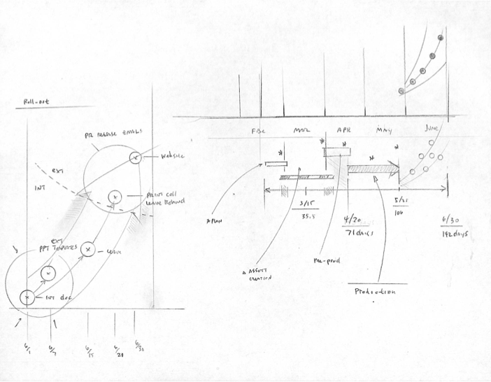
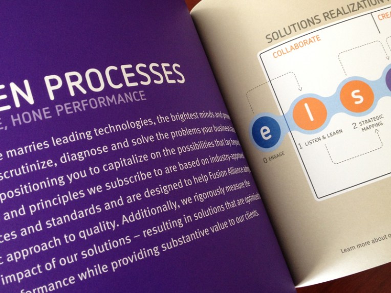
Above: This spread shows a very clean approach to copy combined with a diagram depicting the process for working through the Fusion Alliance (Solution Realization Model – SRM).

Related Projects: The SRM was an entirely separate project which will have its own link eventually. The SRM project entailed working with upper management and sales to identify key sales markets and how Fusion Alliance best fits into the client’s challenge.

vmi2

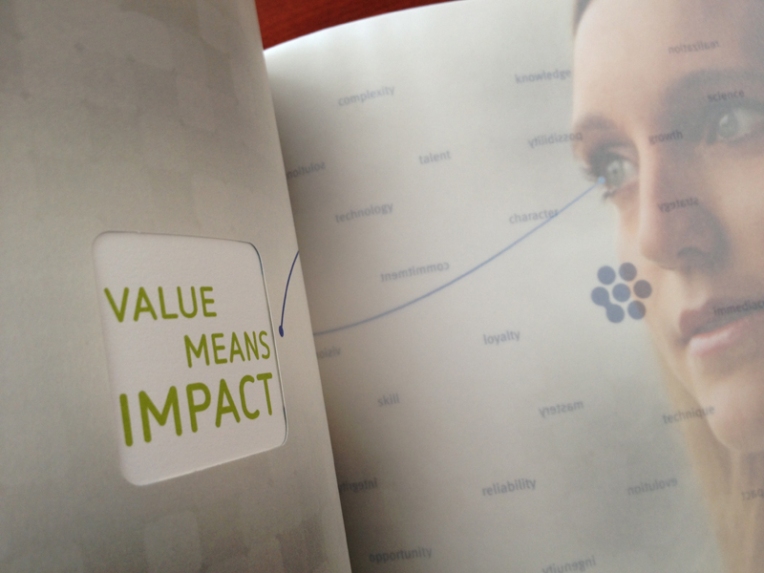
Above: This spread is unique due to have the opening on the left page has a die cut that allow the user to see a new message on the past spread. The rightmost page has a transparency overlay with a series of words that are forwards or backwards depending how the page is flipped.

Related Projects: No stock art was used the publication. We photographed real employees with a real photographer over 2 days. Art Director, Photo Direction

innov_prod

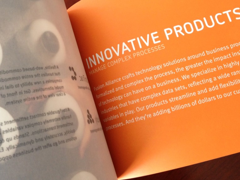
Above: This spread is a beautiful rendition of flat clean design (Single Spot PMS ink). Left side has an image that can be seen through an transparent overlay depicting two part of the Fusion Alliance Company.

Related Projects: No stock art was used the publication. Actual employees were photographed over 2 days. Art Direction, Photo Direction

cust_sol8x6

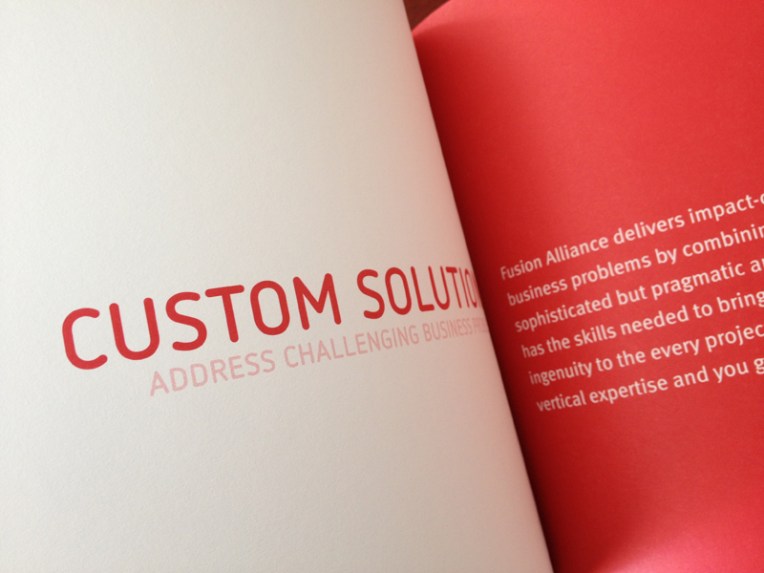
Above: This spread is very simple by design to let the messaging take hold of the reader and become unencumbered by complexity in other spreads.

Related Projects: Typographic applications.

General: This project was a collaboration between Fusion Alliance’s internal marketing team and an external design company. My role was to finish the project and steward the final piece through the final printing process. Skills used in the piece where the following: Management, photo direction, pre-press, photo editing, pre and post printing activities.