More AI Video

Since the first test, I’ve been planning the next set of tests with more detail in my own script development. There is 100+ avatars available – I chose one for general messaging.

Below, The first video was created with AI but using actual human actor references. The lip-sync is spot and and very believable. The script was crafted for a British word usage with a British accent. You can use actual actor voice of that avatar or choose another voice. The second video below (female in red hoodie holding product) was more AI driven – the lip sync seemed a bit off. Overall this is an incredible option for companies with low marketing budgets.

New products

After many months of planning, designing, printing, all three card packs are ready to help people learn more about Siri, Alexa & Google Assistant are available & ready to ship. The website is complete and the square store is up and running. I still need to get these up on Amazon and begin a social marketing strategy.

Stickers too-sticky? Consider Magnets?

Screen Shot 2020-04-10 at 1.28.00 PM
My newest backer suggested magnets since they are easily moved around various surfaces with ease. I looked into the possibility and Sticker Mule was accepting orders. So, I had to test them right? I placed the smallest quantity to get my $10 discount. Within the hour, I just approved the quote and proof for magnet graphics. Let me know if you’re interested or have ideas for the pledge.

If you can pledge, please do…If not, please share this link: https://www.kickstarter.com/projects/jerryvelasco/inspirational-graphic-stickers-for-broad-ripple/

– Thank You!

Missing Wireframes?

As I talk to clients & recruiters about my depth of market space,  I am sometimes told that “there aren’t enough wire-frame examples on your website.” For this reason, I’ve decided to attempt to show the footprint of missing content.
Screen Shot 2020-01-31 at 1.19.34 PM
Am I missing current work examples? Yes. There are 7 total projects in the last 3 years that are not on my website. Most are missing due to confidentiality agreements and HIPPA. I truly respect my past clients so their data will never be shown on my website, emailed, placed in digital forms, etc. With that said, I can discuss my role in the projects as well as the challenges to my role in client environments.


Indy Design Week – May 13-17

Indy Design Week or IDW19 is pushing forth a design focus and campaign like no other event in Indianapolis. Beginning the week of May 13th, Indianapolis will host a series of city-wide events throughout the week, as well as a major line-up of speakers on its core meeting days.DzxyvhLWwAAIzlJ.jpg-large


Newly Added

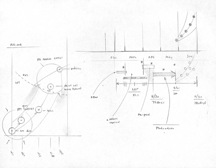
I was auditing my site today (Feb 21) and noticed there was a Sketch section with no sketches. Thats not me! I love grabbing a pencil or dry erase marker and going to town. I’m adding a small blog snippet to re-direct people to the newly updated sketch page. You can see one sketch below. I’ve also added 2 User Journey Maps. They are under work-product since they weren’t created a specific deliverables, but they were useful for conversation with business people and content writers. I’ve also added a journey map after the sketch below.Screen shot 2012-06-10 at 12.12.31 PM

Screen Shot 2019-02-21 at 4.14.45 PM

Sentricon: Appreciated Disgust

Sentricon_web_h1.png

Above: This was the homepage with one photo from the carousel of three images. The basic layout was made to be a convergent approach to messaging from the top-down approach beginning with the homepage. One large image and one message which gets split into 3 diverse messaging channels. (Note: the social icons were not added by me in this screen shot)Sentricon_web_h2.png
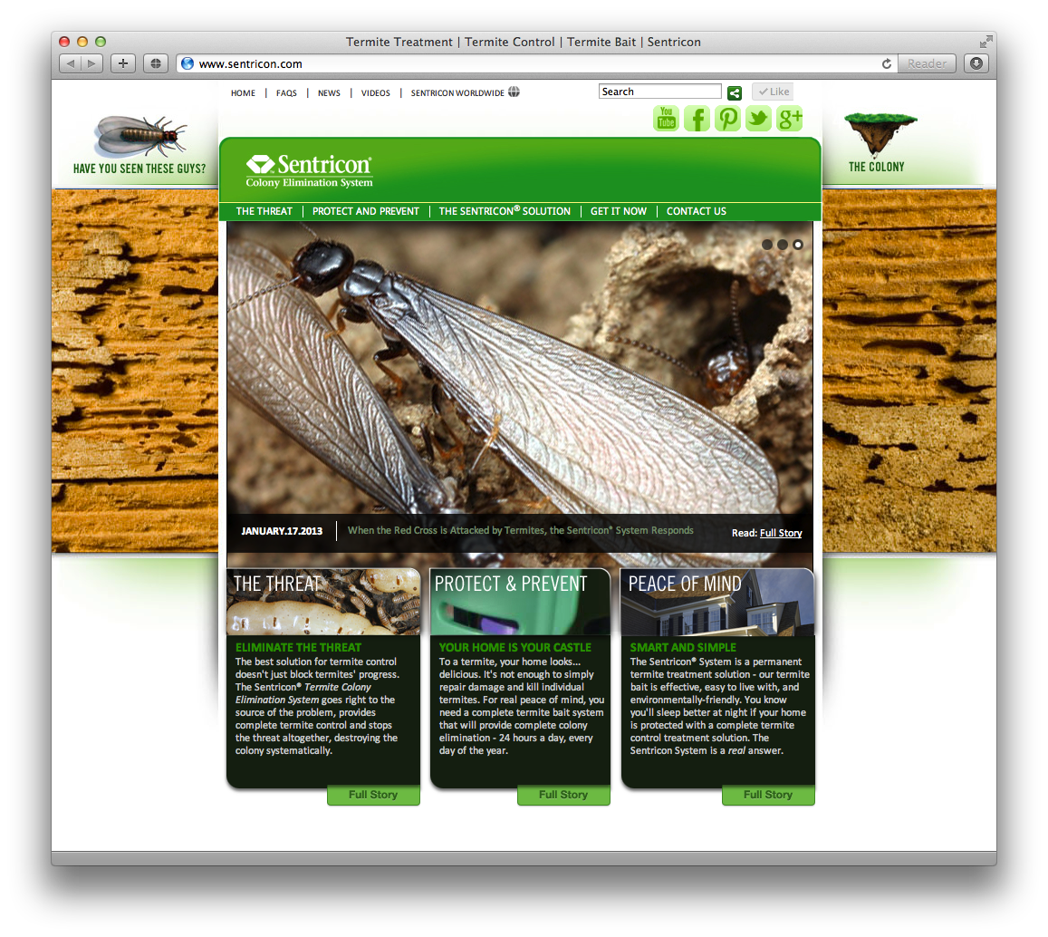
Above: This is the same homepage layout showing another photo. This was an amazing differentiator to the client. The photography was from a distance insect photographer Ph.D. in Entomology; Alex Wilde. His attention to detail and beauty was amazing and unique. I licensed three amazing images for this project to give detail and beauty to something so horrible and destructive to household wood in general.Sentricon_web_m1.png

Above: The other strong and effective messaging was the ability to re-direct with objects within the site.

Below: While only one advert-tout is shown above, below you will find 3 of the full 16 of these objects. Each object had a ‘green rest state’ and a ‘purple mouseover state’. All the message objects were basically macro-projects for the website. I worked with a talented writer and roughed out a large amount of content for the website.

Sent_message_system.png

Today: This project is one my older but it is one of my favorites. And while I’d like think think the client has long moved on…I will still see these pop up every once in a while.
Drees Homes: Web Refresh

Screen Shot 2014-08-29 at 4.02.03 PM.png

Above: This layout was a new way that could be updated over time so as the website could remain fresh for a longer period of time. This was a dynamic shot with an emphasis on amenities of neighborhoods.

General: Drees was needing a better website with a gentle nudge to the future.Screen Shot 2015-01-21 at 12.18.29 AM.png

Above: One of the approaches for the design was to really push everything out to be as clean as possible. Use of typography with hinted icons to bring about specificity without clutter. leadgen_click_crop.jpg

Above: One of the most innovative approaches of effective interaction, was the use of the ‘sticky objects’. These object strategically follow the user without impeding the user journey.

contact_2.jpg

Above: Clean and neat. This is one example of a core design use and application of elegant and clean design.

Wire framing and Exploration

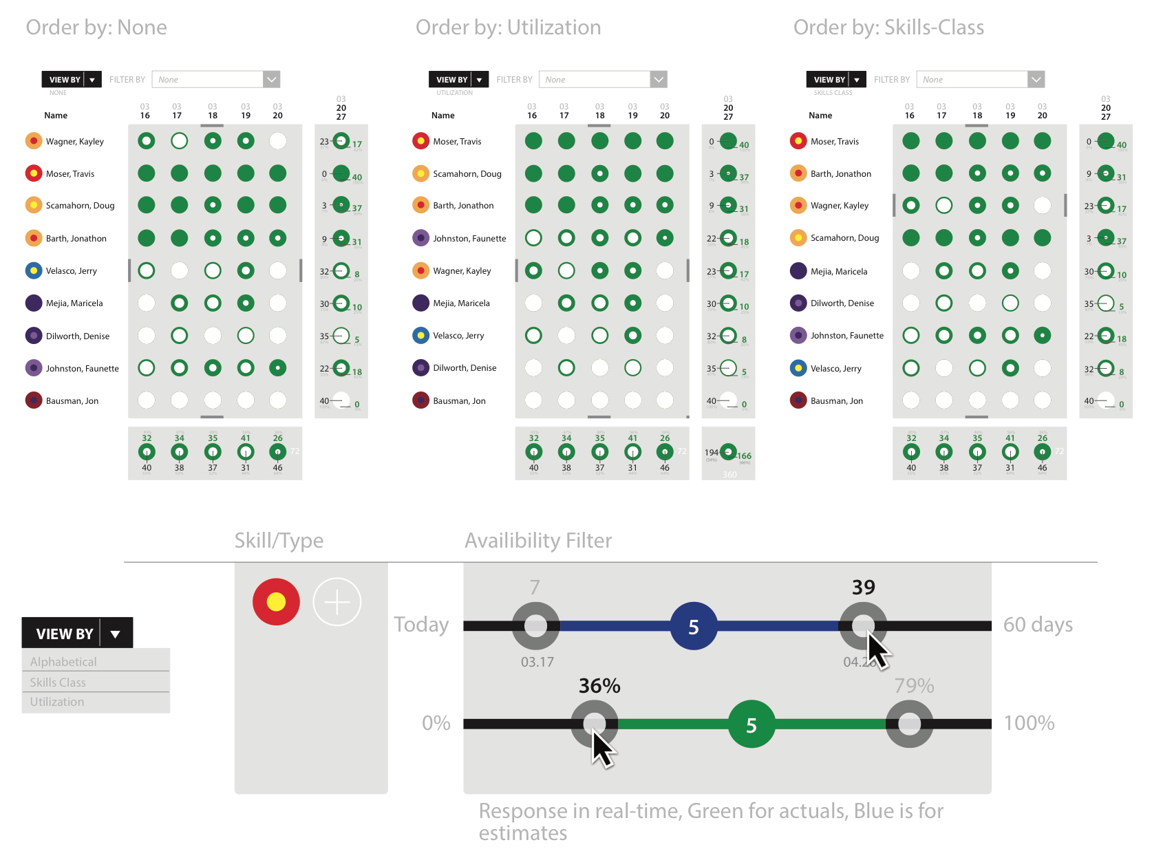
Typically companies rely on boxes and lists to display data. This was an exploratory exercise to start an early concept of an app that would be able to help a company manage their employees usage better then Excel spreadsheets. The work-product below is shown with a balance of wire-frame and light design application.fa_wire1.png

Above: One of the fundamental differences that app would have a core was the ability to show a lot of data in a tight and fluid format(s)fa_wire4.png

Above: The mobile version would still have the strong circular approach to show data.fa_wire2.png

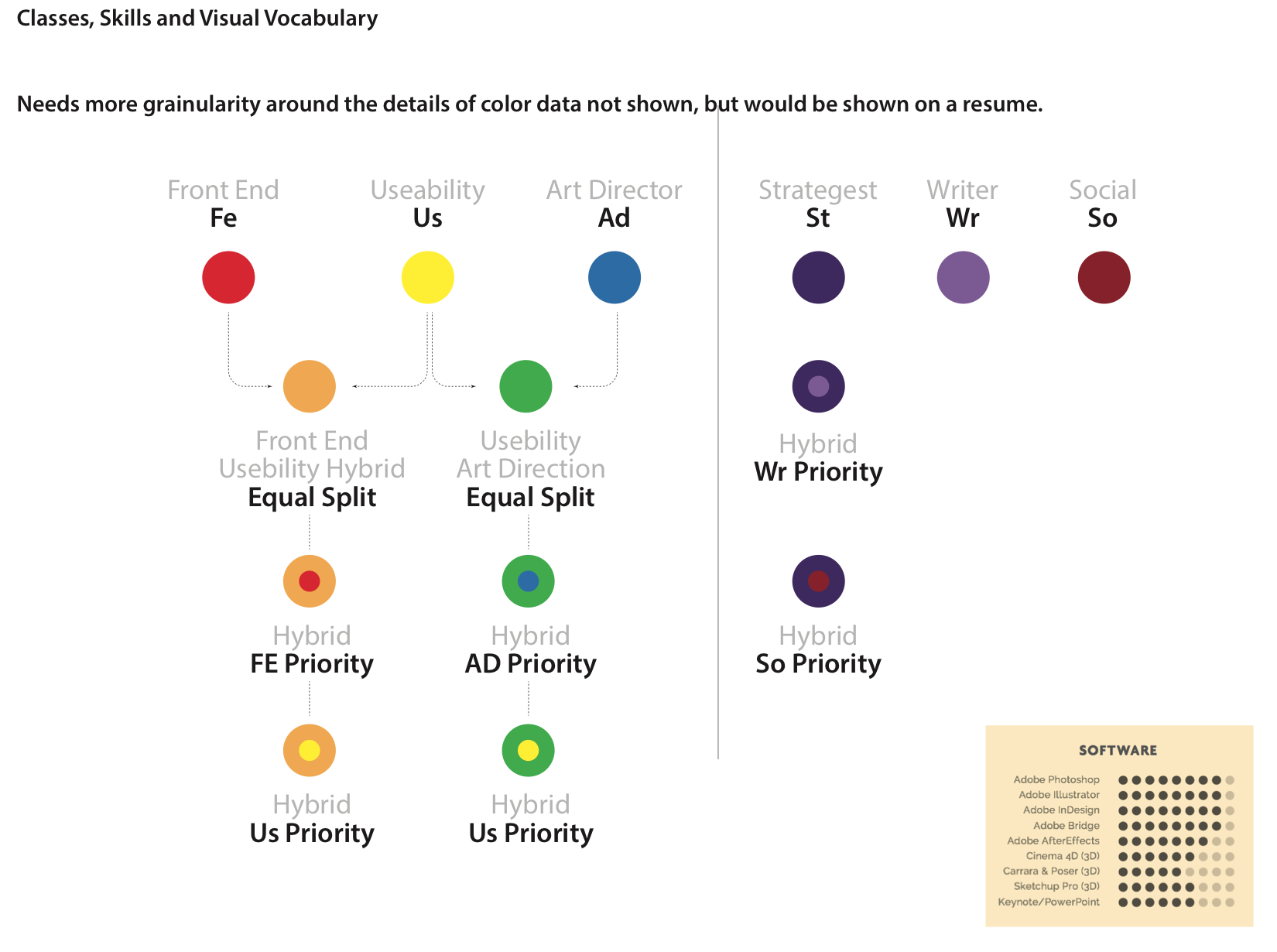
Above: Having a large amount of T-cell people made tracking and application difficult. This diagram was illustrating a system for managing individuals with multiple skills and multiple applications to new work.fa_wire5.png

Above: The desktop version had the most room to display the data. This layout is showing how the desktop version would use the larger space available.