
Above was the featured piece: a single work comprised of 18 Magic the Gathering card designs. Each card tells a unique story (See below) I am dedicating this page to explain the story behind each card. After all 18 cards are revealed, I will also document 14 additional bonus business cards that were not a part of the main piece.

Leave-behind Card 10 – “Eisheth Zenunium, Jerry’s Rep”
OVERALL: This is the last card to be added to this page. The amount of writing and development time was considerable in this project – each card was a mini project. This card was one of the cards printed on metal and contained a QR code. The name Eisheth Zenunium came from an internet search of top popular demon names. This card is from a parallel set of directional series called ‘Jerry Directionals’. This set was similar to UX directionals but the signage was my name instead of UX.
(NEW) AI IMAGERY: This image is one of the top images due to the great composition. Unlike other card images, there is a lot of fire to show the extent and power of the wizard mage. Anytime a figure is emersed in fire without burning, there is a good understanding of the blowback that might be coming your way. The book of Jerry is hot! I needed to photoshop the QR code on the Jerry book. I was pleased that the QR codes work when reversed out of imagery. My only nit is the armor shine is rather white considering the amount of flame surrounding the figure but the white highlights do bring more focus to the figure.

Leave-behind Card 9 – “Azalea, Jerry Manager”
OVERALL: The name Azalea came from an internet search of top popular demon names. This card is from a parallel set of directional series called ‘Jerry Directionals’. This set was similar to UX directionals but the signage was my name instead of UX.
(NEW) AI IMAGERY: The background is in a gloomy forest, only light appears to be natural canopy lighting. Unlike other signs, this one has an arrow shape to it. The leather-clad figure seems like a wizard being there is not sharp weapons – the stave has a pointed tip but the figure doesn’t appear dressed for combat. Most interesting feature in the composition is the lighting on the figure – well placed shadows accent the attributes of the figure. I held back an urge to add glowing eyes. The slight flowing wind is shown in the hair and cape. It’s also interesting that she appears to be walking away from the signs direction but she’s my rep and doesn’t need to be near me if she’s out representing me. Overall there is a lot of mystery in this composition which is why I really enjoyed it.

Leave-behind Card 9 – “Syr Velasco, UX Champion”
OVERALL: This card is from a set of directional series called ‘UX Directionals’. Where the main figure is holding signage.
(NEW) AI IMAGERY: This image was chosen for the overall dark elements. The typical iconic knight is shrouded in darkness and dark metal armor. The figure is facing away from us showing their backside. The silhouette wonderfully depicts the sharp outlines of the armor. Armor highlights hint of a well lit canopy. The background is odd being it has some indoor/outdoor elements. There is a hint of a fire light in the lower right corner and warm highlights on the lower-right area of the knight. The signage design appears custom made for the armor. The UX font and color are the color-cool elements in the composition making it stand out amongst the overall gloomy composition.

Leave-behind Card 8 – “Lamia, Hiring Manager”
OVERALL: The name Lamia came from an internet search of top popular demon names. This card is from a parallel set of directional series called ‘Jerry Directionals’. This set was similar to UX directionals but the signage was my name instead of UX.
(NEW) AI IMAGERY: Overall great composition with a lot of subtle work going on. The figure and the sign compete for attention in this layout. The AI created the Jerry Sign really huge, more like a billboard. The font for Jerry was crazy and odd. Its seems to have created each letter separately – look at the two R’s. The structure of the sign is very dark yet Flintstone in design. The color-choice of red for the lettering makes Jerry really stand out. The background is outside and lighter than the other dark forest imagery created by AI. The figure has no armor but appears to have razor sharp Demi-gaunts. The figures hair is swooping not sure if it’s wind or scary magical hair that will kill me. The figure is also holding large dagger which is cropped out.

Leave-behind Card 7 – “Naamah, Hiring Manager”
OVERALL: The name Naamah came from an internet search of top popular demon names. This card is from a parallel set of directional series called ‘Jerry Directionals’. This set was similar to UX directionals but the signage was my name instead of UX.
(NEW) AI IMAGERY: Background is great – blueish, dark forest, very gloomy with a small amount of warm lighting on the bottom left to indicate a fire nearby. The backlighting gives contrast to the figure and really defines the edges to the figure and the signage. The glowing eyes of the warlock make the scene complete. The crazy ornamentation of the sign is really cool visually by the somewhat spiky and organic sign design. The font is crazy weird and looks like magic created it. Overall a really nice composition for a leave-behind card.

Leave-behind Card 6 – “Syr Velasco, UX Champion”
OVERALL: This card is from the UX Design series called ‘UX Directionals’.
(NEW) AI IMAGERY: This composition made it to the ‘print’ round due to the fact that the figure is a traditional white Paladin. Great traditional image to hand out as a business card. The light and shiny armor with gold trim work. The sign is bright with black UX lettering. The background is placed inside a castle or church. The shadowing is great and cuts the paladin down the middle.

Leave-behind Card 6 – “Agrat Bat Mahout, Head Hunter”
OVERALL: This card is from the UX Design series called ‘UX Directionals’. The name came from the top 10 female demon names. One of the spicier versions. Impractical female-battle-armor. I didn’t note this earlier, but the ‘leave behind’ series also is differentiated by my logo where magic ‘faction’ watermark resides on normal Magic cards. My logo on a green background is on the back (see image below).
(NEW) AI IMAGERY: The AI prompt was a ‘dark paladin surrounded by flames’. The UX sign is more of a metal-type of sign held by the figure. I like how the sign’s UX appears to be cut out and you can see flames showing through the lettering. The flames are well-created and add a sinister and magical fire damage ability of the figure. There are hand issues, but overall the composition was deemed good and usable.
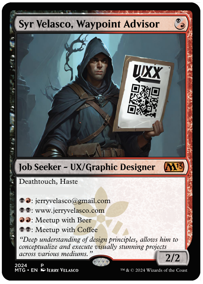
Leave-behind Cards 5a & 5b – “Syr Velasco, Waypoint Advisor”
OVERALL: This card is from the UX Design series called ‘UX Directionals’. This is the non-spicy kinda moppy me version. No sexy armor, just a dude in a hood peddling his credentials. I didn’t note this earlier, but the ‘leave behind’ series also is differentiated by my logo where magic ‘faction’ watermark resides on normal Magic cards. My logo on a green background is on the back (see image below).
(NEW) AI IMAGERY: When the AI tool first showed me this image, I was totally thinking it was not selling point to show some dude in a rain-poncho with a sign. Something stuck about how plain and lackluster the image was. This was the very lowest G version of all the imagery – no fashionable sexy combat armor – no boob-armor adorned warlock characters at all. – Just a dude in a hand-made unadorned rain poncho holding a QR code sign pointing with an arrow at his sorry self in the middle of dark and dank forest. If any image represented me visually in my quest for employment, it would be this image. The AI put another X in UX which I found kinda cute and stupid at the same time – like my current situation…cute and stupid. In hindsight, that should have been the name of the card….’Cute and Stupid’ … lol.
GAME ATTRIBUTES: (see below)

Leave-behind Card 4 – “Eisheth Zenunim, Jerry’s Rep”
OVERALL: This card is from the UX Design series called ‘UX Directionals’. Based on the image, this card had two versions based on QR code location. These were created to show the focus of UX by having a fantasy character hold a UX sign. I didn’t note this earlier, but the ‘leave behind’ series also is differentiated by my logo where magic ‘faction’ watermark resides on normal Magic cards. My logo on a green background is on the back (see image below).
(NEW) AI IMAGERY: Double card variants! I really liked both of the layouts and ended up printed both. The signage in both versions produced by the AI is really interesting. This AI produced imagery giving the figure two sign objects. I added a QR code the the tablet. The overall composition is remarkable in how all the objects float well in the given small space. I needed a QR space and the extra ‘signage object’ worked well. Even with the distorted QR code, it still works. Most notable is the highlights on the figure suggesting there is a good amount of moonlight off-scene. The ‘fashionable armor’ while impractical for close combat, does have an interesting construction from a compositional viewpoint. As for armor engineering in medieval skirmishes we may want something better however, I’m assuming if you were wearing this armor, you’d have some mystical advantage which would stop most opponents from getting very close.
GAME ATTRIBUTES: (see below)

Leave-behind Card 3 – “Experience Tactician”
OVERALL: This card was 1 of 2 which were created as a ‘metal’ card, which is why I added the QR code. While this card was designed for the handout series, it was not intended to be given away, instead the potential meetup would scan the QR code. This card is from the UX Design series called ‘UX Directionals’. These were created to show the focus of UX by having a fantasy character hold a UX sign. I didn’t note this earlier, but the ‘leave behind’ series also is differentiated by my logo where magic ‘faction’ watermark resides on normal Magic cards. My logo on a green background is on the back (see image below).
(NEW) AI IMAGERY: This image conveys the sour and desperate methods in which looking for a job is such a horrible process. The grim corpse-like figure holding up the link to their resume or website peddling his want for employment on the street. What a pathetic existence this poor fellow must have in his life. When will he hear back from any anyone? The sunken frowning face depicts the pain and sorrow associated with rejection in a process that offers no reasons for the situation he is now a part of.
GAME ATTRIBUTES: (see below)
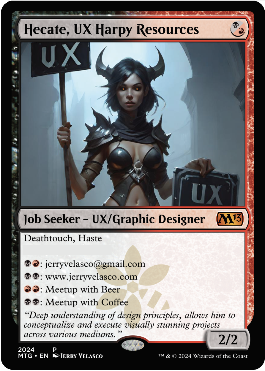
Leave-behind Card 3 – “Hecate, UX Harpy Resources”
OVERALL: I had fun with the name swapping ‘Human Resources’ with ‘Harpy Resources’. Hecate is one of the top 10 popular female demon names. This UX directional is from the spicy side of AI production. Typically for this project, I did no photoshopping but on this image, I did have to fix the eyes. This card is from the UX Design series called ‘UX Directionals’. These were created to show the focus of UX by having a fantasy character hold a UX sign. I didn’t note this earlier, but the ‘leave behind’ series also is differentiated by my logo where magic ‘faction’ watermark resides on normal Magic cards. My logo on a green background is on the back (see image below).
(NEW) AI IMAGERY: The lighting is good and the mood was dark and scary. The overall color palette is bluish avoiding any warm colors at all. The figure is somewhat attractive and scary at the same time. The figure is adorned in light-pointed-battle-armor. The horns are a bonus – really made a good impression by contrasting with the lighter part of the background. The signage is odd and the fonts don’t match but double-pumping UX is helpful for leave-behind material. AI prompting is somewhat experimental and a journey of finding the image you want. I was impressed with the overall composition amongst the 30+ image renders.
GAME ATTRIBUTES: This card wasn’t design to be played – it was to be used as a business card during the event. I wouldn’t recommend playing this card but if you had to, this would be a 2/2 creature with death touch and haste. It would be a good 1 mana play on turn 1. The in-game mana abilities wouldn’t help during the game at all unless you were playing me and I might have to leave to meet with you during a game and lose the game out of forfeit.


Leave-behind Card 2 – “Syr Velasco, UX Champion A”
OVERALL: This is from the UX Design series called ‘UX Directionals’. These were created to show the focus of UX by having a fantasy character hold a UX sign. There was some spicy cards and some less-spicy cards – this was one of the less-spicy images as the figure is completely covered in armor. Syr is a knight pre-fix neuter version Sir. Creature is me, the job seeker UX Designer / Graphic Designer. As of this post, I am still seeking employment.
[I’m adding a new section below as it will be the differentiating factor of the leave-behind cards. The game attributes won’t change from card to card.]
AI IMAGERY: AI prompting is somewhat experimental and a journey of finding the image you want. I was impressed with this composition. The lighting is good and the mood was dark and scary. The highlights on the armor indicate a small village of perhaps a fire near the figure. The sign shape had a fantasy shape with sharp edges. Knights are considered good agents generally, however this one appears more of a dark nature. The silhouette creates a good number of sharp edges to the armor. The UX font color was red which aligned to the color identity of the card itself.
GAME ATTRIBUTES: This card wasn’t design to be played – it was to be used as a business card during the event. I wouldn’t recommend playing this card but if you had to, this would be a 2/2 creature with death touch and haste. It would be a good 1 mana play on turn 1. The in-game mana abilities wouldn’t help during the game at all unless you were playing me and I might have to leave to meet with you during a game and lose the game out of forfeit.

Leave-behind Card 1 – “Lilith, Hiring Manager”
OVERALL: I wanted to be able to have cards that I could hand out at the event. This magic card is basically a business card with use for mana-based connection possibilities. I found a listing of the most popular demon names and applied a unique name to the card. Some are more spicy than others, so I had to make a set of non-spice for each spicy version – I didn’t want to offend anyone when I was seeking employment.
AI IMAGERY: AI prompting is somewhat experimental and a journey of finding the image you want. I was impressed with this composition. Overall, The lighting is interesting and the mood was dark and creepy forest vibes. Not sure I would hang a sign with my name on it in the middle of a creepy, dark dank forest but it’s what the genre the AI chose. The ‘Jerry sign’ seems oddly crafted with the jutting wood framing. The orange font is grossly presented and appears hand-made – love it! The moss, wires and chains hanging off the sign sets an eerie vibe of an established organization in this creepy forest. The figures outfit is leather which implies a rogue type of character. The gloves and shoulder guard are battle-pointed and deadly. The characters hair flows with interesting curliness as she looks left. I liked the blue-ish high-lighting on the figures head.
GAME ATTRIBUTES: This card wasn’t design to be played – it was to be used as a business card during the event. I wouldn’t recommend playing this card but if you had to, this would be a 2/2 creature with death touch and haste. It would be a good 1 mana play on turn 1. The in-game mana abilities wouldn’t help during the game at all unless you were playing me and I might have to leave to meet with you during a game and lose the game out of forfeit.

Card 18 – “Prismatic Pauldrons”
OVERALL: This image was found through the experimentation while prompting the AI tool. This overall color palette and composition was so amazing, I had to make a card just for the image. This card is identical to Gabriella’s Breastplate.
GAME ATTRIBUTES: The mana cost seems a high, but flying and hex proof is a wining combo to place on one creature. The equip cost is pretty low, so once you get this card out, it should be easy to move around to other creatures as needed.
Prismatic Pauldrons is card 18 of 18 – the last card from the series. It’s easy to overlook all the content on a magic card – I hope you have enjoyed my explanation of each card in the series.
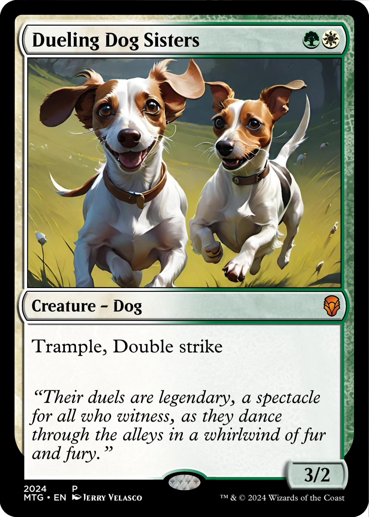
Card 17 – “Dueling Dog Sisters”
OVERALL: You’ve seen these dogs in their own separate cards but originally this card was supposed to be the only mention of my dogs. They are so lovable, I had to make more cards space for these two dachshunds. They are half sisters and are inseparable pups. Even though they’re not really puppies anymore they have somehow kept their ‘puppy energy’. When we first adopted them, we made a small round circular fence in our back yard. They would run in different directions around the edge of the fence – It was so hilarious.
GAME ATTRIBUTES: Double strike is a given to the card, since the card represents two creatures in one card. Trample is present but not too fierce but for two mana it’s an early game card for sure and it should be pumped-up towards the mid-game. Statistically, this card should have been a 2/2 creature but to support the duality theme, I added one more attack point.
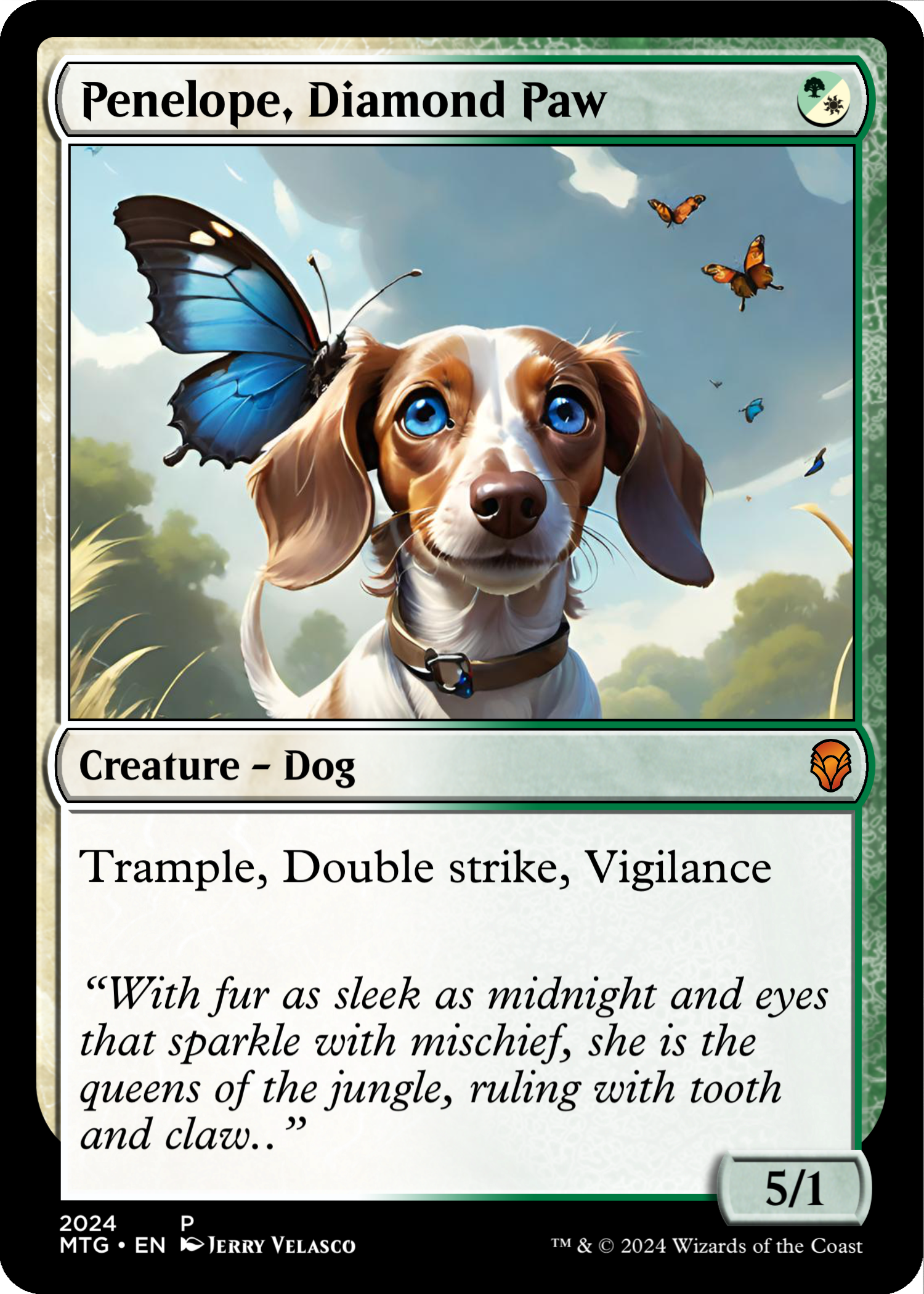
Card 16 – “Penelope, Diamond Paw”
OVERALL: Penelope is my other dog. She deaf and wonderful. She is a loving and peaceful dachshund. She is really smart and can be very resourceful. She sometimes will watch TV. Like the name, her paw actually has a diamond shape.
GAME ATTRIBUTES: This card is very over-powered. Hitting the battlefield with Trample and double-strike can cause serious damage in the first 3 turns. Even with all that power, with a 1 defense it can be easily removed.

Card 15 – “King’s Bark Horn of Doom”
OVERALL: This is a very personal story near my heart. This card is devoted to one of my dogs. This one goes on a barking tangent that could go on for hours if left to its own devices. Yes, my dog but a lot of barking – so much barking it hurts.
GAME ATTRIBUTES: Low mana cost of 1 will let you get this bugger easily on the battlefield to annoy your opponents. Ease of battlefield presence isn’t enough, it a 5/1 that coming in swinging on turn one with double-strike – so your opponents are going to feel an early game issue of 10 damage if they’re not careful in the early-game. Good luck suckers, this card is annoying.

Card 14 – “Gabrielle’s Spiked Breastplate”
OVERALL: This image showed up out from a series of image generations. The texture and composition seemed very ‘magic’. I also wanted to create a card that wasn’t a creature.
GAME ATTRIBUTES: The mana cost seems a high, but flying and hex proof is a wining combo to place on one creature. The equip cost is pretty low, so once you get this card out, it should be easy to move around to other creatures as needed.

Card 13 – “Lyra Blossomer”
OVERALL: This was a derivative image from the 50+ rounds of image creation. The image was created when prompting for the card, “Jerry, the Grower of Things”. Probably one of the only cards created based on the exploratory aspect. I set it aside as a good creation. As with most AI, the hand has some issues but was crucial for the fruit to be in the layout. For this project, I promised that I would not use Photoshop, so the hand-fruit element stayed in the image as is.
GAME ATTRIBUTES: This card’s core function is to allow the player to place an extra land per turn. This will allow the player to grow their resources faster than the other players and eventually allow them to cast more spells over the course of the game.
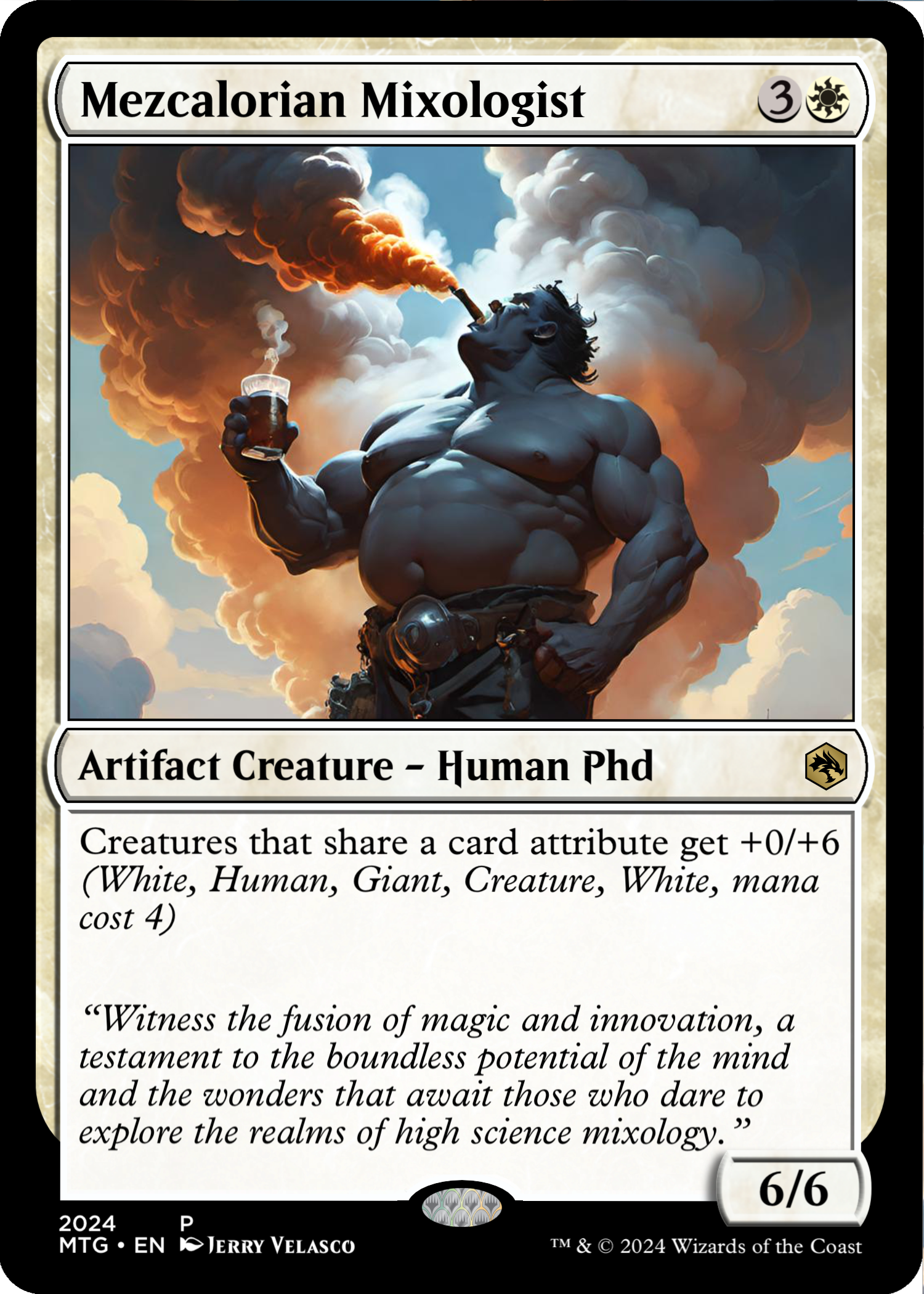
Card 12 – “Mezcalorian Mixologist”
OVERALL: This is a second iteration of the Mixologist card. I couldn’t pick a finalist, both images conveyed the huge smokey flavor of Mezcal. This card was added to represent my brother-in-law. He is one of the only people I know who has a large knowledge base of Mezcal. If you’re lucky, at night he might have an impromptu tasting from his most beloved top-shelf Mezcals. If you’ve not tasted Mezcal, try it sometime – It’s unique and there is a large range of flavors – it has a distinct smoky flavor. Most mezcals taste differently than their aroma – expect the unexpected. Mezcal’s flavor is highly dependent on its artisanal production methods and the specific environment where the agave plants are cultivated, making each bottle a unique tasting experience. His favorite mezcal drink is called the ‘Better than Jerry’ which basically my favorite Tequila drink of Tequila, Club Soda and 2 lime wedges – He uses Mezcal instead of Tequila.
GAME ATTRIBUTES: Like my brother-in-law, this card loves to share what it has – Here, it’s the base defense with other like creatures. This takes on the mono-white position and is a large ground creature. As white is often, it’s overpowered as this card shares a 0/6 attribute with other creatures which might share its attributes. A tiny white 1/1 bird will now be a 1/7 flying bird as long as this card is on the battlefield.
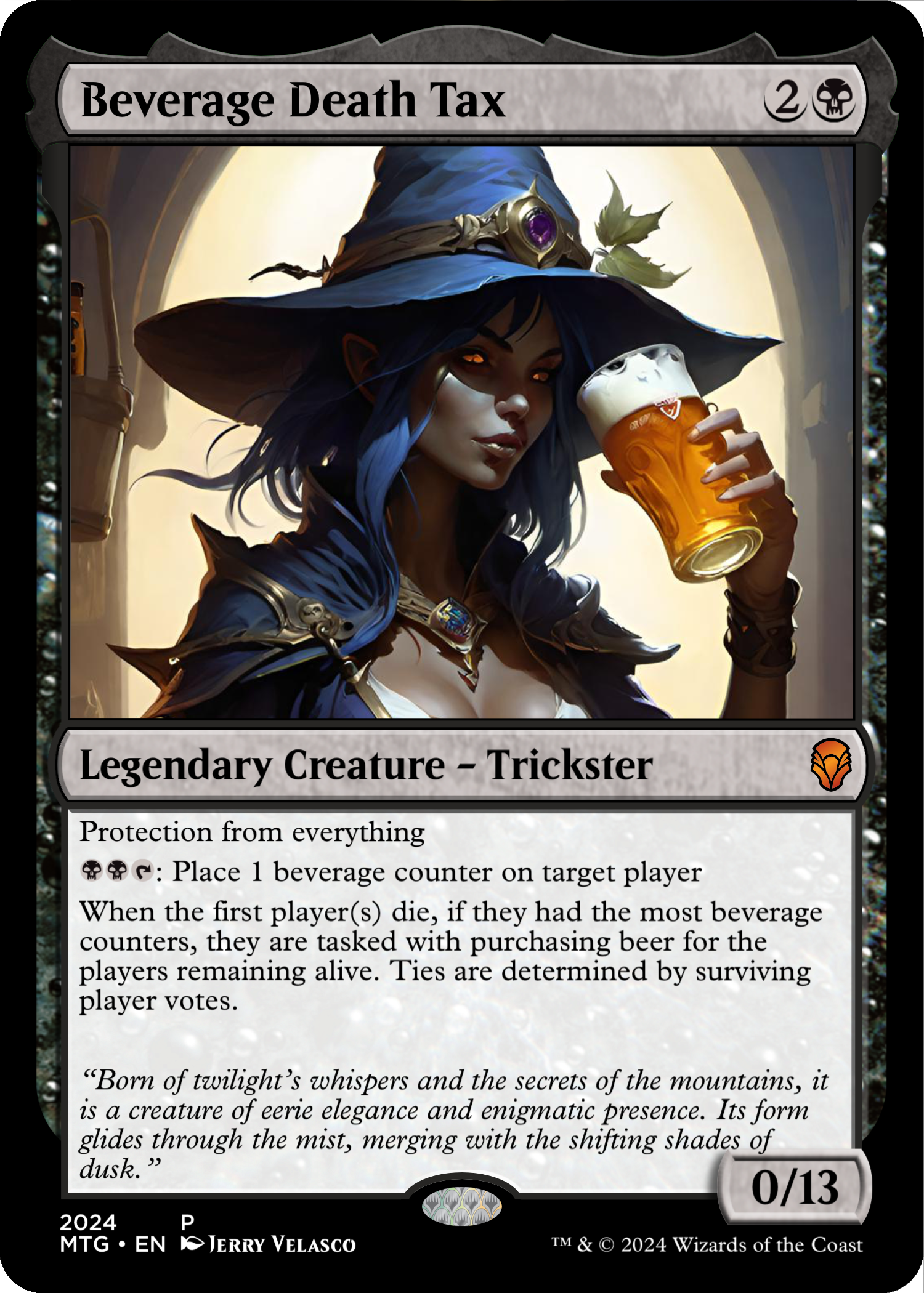
Card 11 – “Beverage Death Tax”
OVERALL: This is another card with a different image. I changed the title too – which is more fitting. This card represents a new shift in how I play weekly Magic the Gathering. We used to have an active 60-card weekday night group (4-6 players) on Wed/Thursday night. Over the years the a player would stop playing. Including myself, eventually it came down to 2 players. It was fun for a while, but 2 player games become boring as both players start to memorize the other players decks. We agreed to ventured out to find new players for our magic play night. What we found, was a thriving player base of ‘commander’ players at the Upland Magic Group (UMG). They play weekly on Sunday at Upland Brewery between 12-8p. There are always 15+ players in total and usually there are 5-10 players rotating in and out on Sundays. This past year, Sunday is Magic day with the UMG at Upland Brewery.
GAME ATTRIBUTES: This card is mono-black and was designed to be snuck into actual game play with UMG. Having protection from everything means it doesn’t go away. Since UMG plays in a brewery, it makes sense to have some kind of operating rules around how players pay for beer rounds. Besides being a great blocker (without flying) it determines that of a 4 player game, the first player out, buys the round for the surviving players as long as the card is in-play.
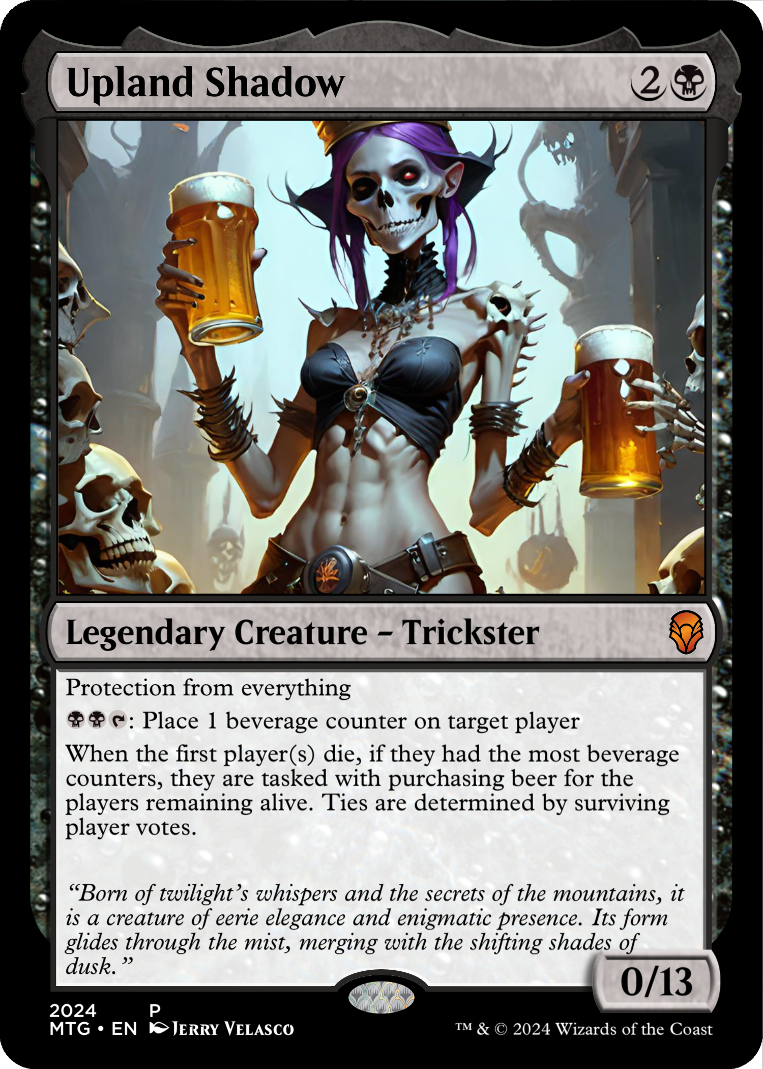
Card 10 – “Upland Shadow”
OVERALL: This card represents a new shift in how I play weekly Magic the Gathering. We used to have an active 60-card weekday night group (4-6 players) on Wed/Thursday night. Over the years the a player would stop playing. Including myself, eventually it came down to 2 players. It was fun for a while, but 2 player games become boring as both players start to memorize the other players decks. We agreed to ventured out to find new players for our magic play night. What we found, was a thriving player base of ‘commander’ players at the Upland Magic Group (UMG). They play weekly on Sunday at Upland Brewery between 12-8p. There are always 15+ players in total and usually there are 5-10 players rotating in and out on Sundays. This past year, Sunday is Magic day with the UMG at Upland Brewery.
GAME ATTRIBUTES: This card is mono-black and was designed to be snuck into actual game play with UMG. Having protection from everything means it doesn’t go away. Since UMG plays in a brewery, it makes sense to have some kind of operating rules around how players pay for beer rounds. Besides being a great blocker (without flying) it determines that of a 4 player game, the first player out, buys the round for the surviving players as long as the card is in-play.

Card 9 – “Sunking Cervesalorian” – Iteration 2
OVERALL: This is iteration 2 of a previous card. It worked so well, I created another version of it. It will most likely get replaced by The One card. You’ve heard of the Honey Badger, this is the Beer Badger. This badger cannot get enough of their favorite beer. This card is me in a ‘beer’ form. As you can tell from the cards title, I’m a big fan of Sunking Brewry . This card pays homage to Sunking for all the great beers it makes (just for me). In fact, yesterday, I biked from Broadripple up to the Carmel location to get beer only available in the brewery. I love to taste all new beers and typically order flights of beer.
GAME ATTRIBUTES: This card is two-colored – red (speed) and white (purity). Two mana cost is low and fast. Upon turn 2 this guy can come out swinging. It has haste upon entering the battlefield. For 2 mana it can give itself double-strike anytime it needs it.
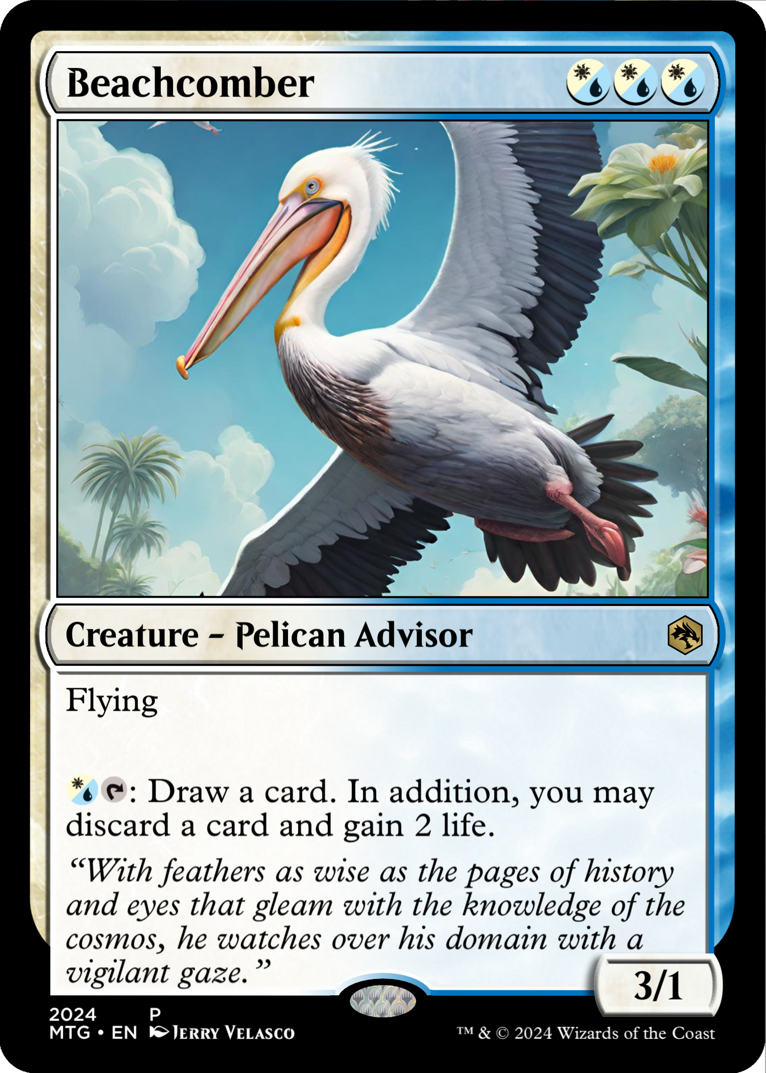
Card 8 – “Beachcomber”
OVERALL: This card represents my father-in-law. His presence touched so many lives. The moments I cherish the most are when we’d be on vacation on a beach – He always had great advice when you needed it. On the beach, he would notice a Pelican in the sky and always mentioned how majestic the Pelican was to him. It’s life was about soaring over the beach and diving for dinner when hungry. Even flying, it didn’t flap its wings as leveraged the wind of beach to keep it afloat. “Imagine having that kind of life and flying with other birds and being able to fly anywhere you wanted.” He’s passed away many years ago and to this day, when any family member sees a solitary Pelican, they say, “Look there he is…he’s watching over us.”
GAME ATTRIBUTES: Choices in Magic are really important. This card not only aids in drawing more cards but also lets you choose to get some extra life to keep your score afloat – What could be a more sustaining white/blue card? This creature in the early to mid-game, can fly around and do 3 damage until the attacks don’t work and draw some more cards. The best part is the choice of discarding to gain life when you have cards you don’t need. I really like this card. Only addition might be to give it vigilance so It can attack and draw a card.
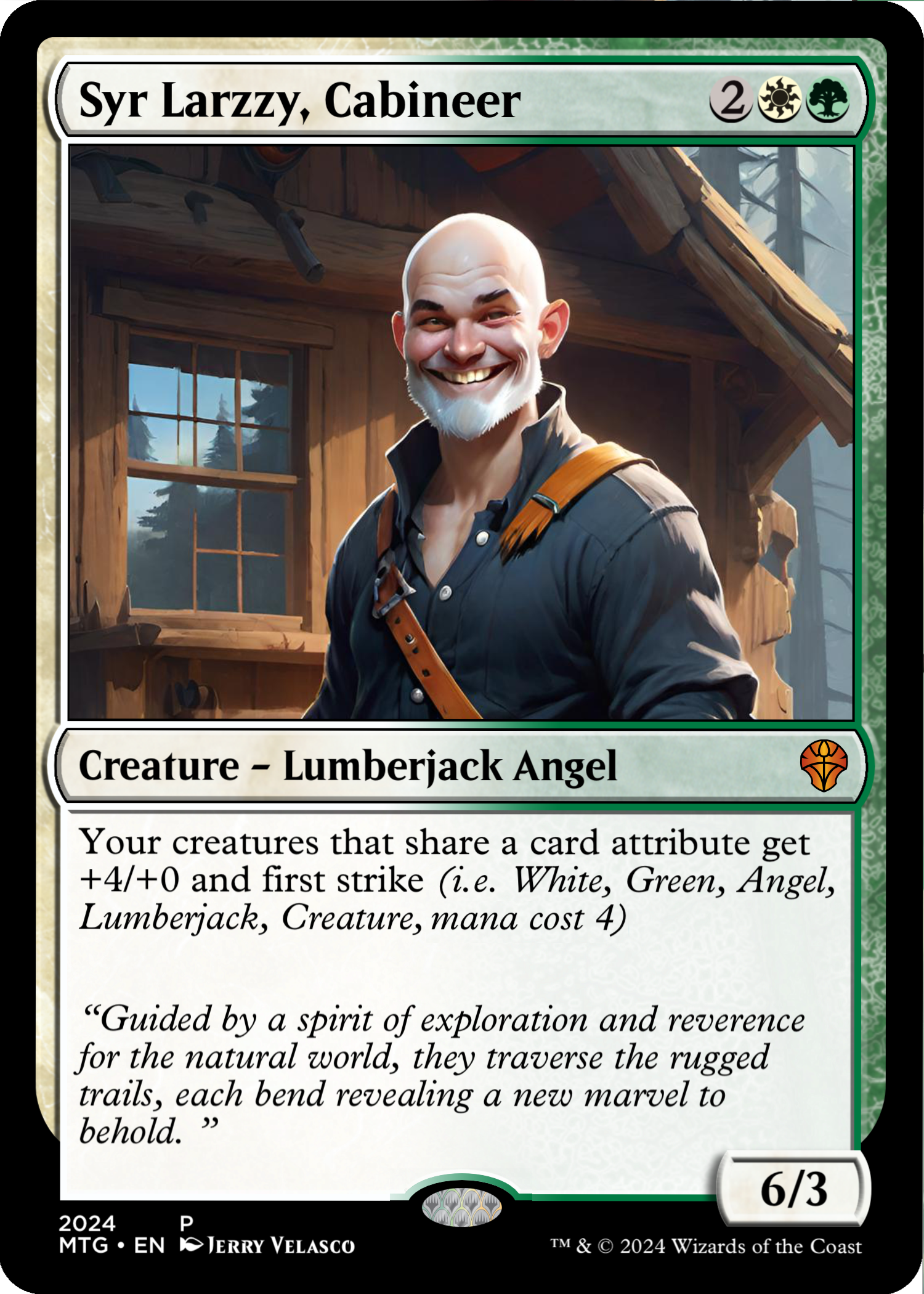
Card 7 – “Syr, Larzzy, Cabineer”
OVERALL: This card represents a friend and fellow designer who has helped me along my job search. Many people help or feel sorry for me, but as an angel creature, he mass emailed all his contacts/friend and has forwarded many leads to me. As a lumberjack he is an avid camper and travels many times a year to see outdoor excursions. As a Cabineer, he loves all types of cabins. He has a great deal of merchandise at Timber Design Company. Currently but for a limited amount of time, he also has posters up in store in Broadripple (Bungalow). He typically also sells his merchandise at the Kringle Market for 4 weeks in December. Definitely check out his work and his merchandise, both are fantastic. if you meet him in-person, you will notice he is quick to share and help others with his business-changing design and wholly as just a good person. He is a gem in our crazy and selfish world.
GAME ATTRIBUTES: Being he is a creature of purity and rules with respect of earth and natural elements, it makes sense that this card is green/white. Like his actual personality, he is a sharing creature that gives a bonus attack and first strike – totally insane but its white green.

Card 6 – “Mezcalorian Mixologist”
OVERALL: This card was added to represent my brother-in-law. He is one of the only people I know who has a large knowledge base of Mezcal. If you’re lucky, at night he might have an impromptu tasting from his most beloved top-shelf Mezcals. If you’ve not tasted Mezcal, try it sometime – It’s unique and there is a large range of flavors – it has a distinct smoky flavor. Most mezcals taste differently than their aroma – expect the unexpected. Mezcal’s flavor is highly dependent on its artisanal production methods and the specific environment where the agave plants are cultivated, making each bottle a unique tasting experience. His favorite mezcal drink is called the ‘Better than Jerry’ which basically my favorite Tequila drink of Tequila, Club Soda and 2 lime wedges – He uses Mezcal instead of Tequila.
GAME ATTRIBUTES: Like my brother-in-law, this card loves to share what it has – Here, it’s the base defense with other like creatures. This takes on the mono-white position and is a large ground creature. As white is often, it’s overpowered as this card shares a 0/6 attribute with other creatures which might share its attributes. A tiny white 1/1 bird will now be a 1/7 flying bird as long as this card is on the battlefield.

Card 5 – “Sunking Cervesalorian”
OVERALL: You’ve heard of the Honey Badger, this is the Beer Badger. This badger cannot get enough of their favorite beer. This card is me in a ‘beer’ form. As you can tell from the cards title, I’m a big fan of Sunking Brewry . This card pays homage to Sunking for all the great beers it makes (just for me). In fact, yesterday, I biked from Broadripple up to the Carmel location to get beer only available in the brewery. I love to taste all new beers and typically order flights of beer.
GAME ATTRIBUTES: This card is two-colored – red (speed) and white (purity). Two mana cost is low and fast. Upon turn 2 this guy can come out swinging. It has haste upon entering the battlefield. For 2 mana it can give itself double-strike anytime it needs it.
A link on my website will assist users in comprehending the anatomy of Magic: The Gathering cards. Understanding details will deepen understanding of the cards’ intricacies I’ve created.

Card 4 – “Basket Under the One Bridge”
OVERALL: This is likely the only negative card in the entire set of 18. It represents the event from last year when I was laid off after 7 years with a stable, employee-owned company. Despite their claims of treating employees like family and making several promises, they let me go. While the exit was handled politely, it felt like a betrayal of the long-time promises made throughout my tenure. This card symbolizes the ‘basket of lies’ given to to me and all their other employees. I’m not planning to call out their name here but there is subtle hints in the flavor-text. The original name was One Bridge Basket of Lies.
GAME ATTRIBUTES: The mono-color is black. Instead of a creature its a curse that can effect gameplay of your opponents land. Typically, I’ve only seen phasing affect your own cards. When this card gets played it can target all opponents non-basic lands. It’s a really mean card and can make certain lands unusable for your opponents. It may be over-powered – I should have added “until end of the turn” to give a bit less power. As it stands, it can be lessened in power or made to be mythic-rare. In the actual game, if this card were to become really popular, it would be banned. Magic the Gathering keeps a banned and restricted list.
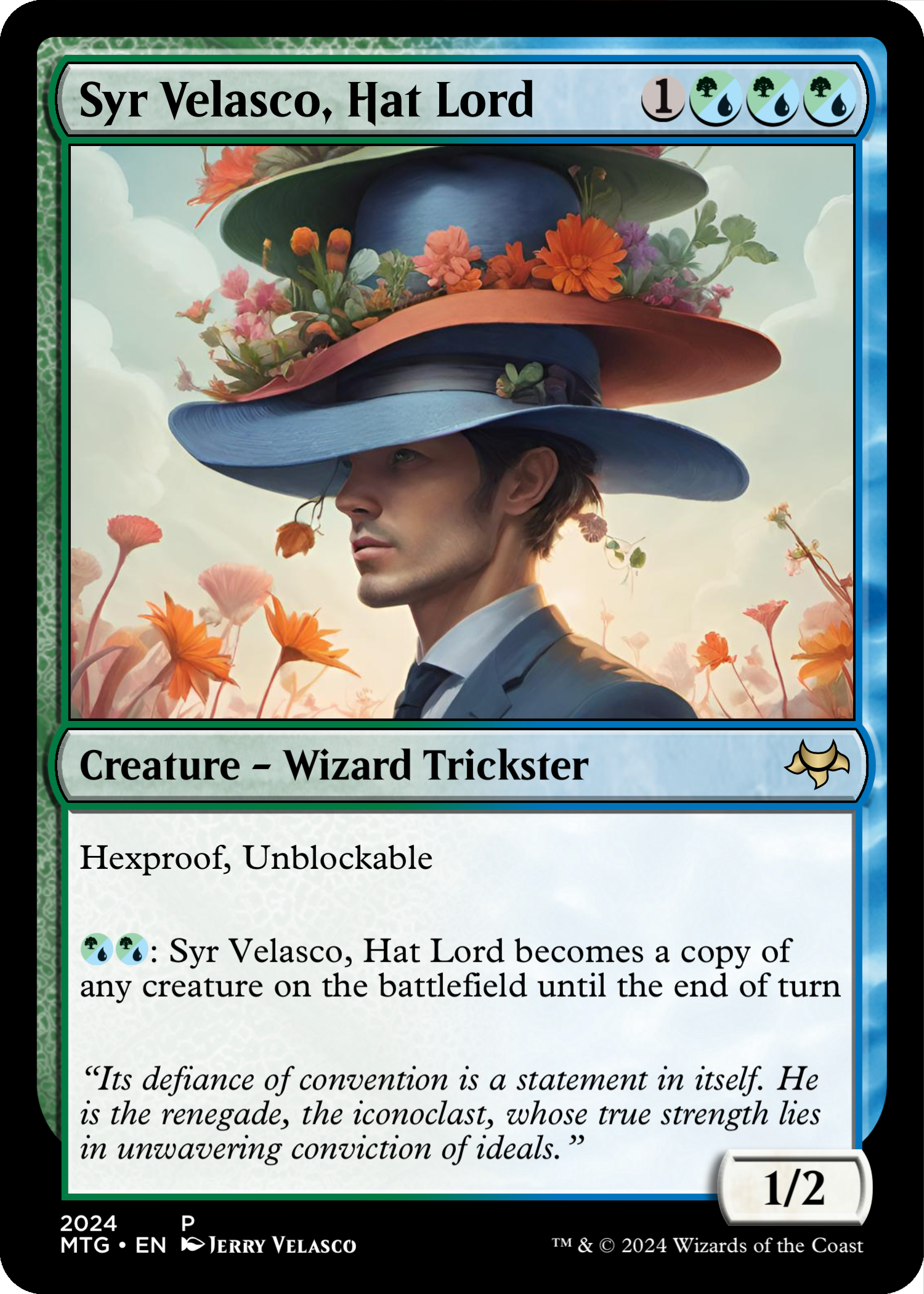
Card 3 – “Syr Velasco, Hat Lord”
OVERALL: This card humorously depicts my penchant for collecting hats. With over 50 caps in my collection, I can’t resist purchasing one whenever I come across an interesting design, whether it’s in a store or at an airport during a connecting flight. However, I have specific criteria: the cap mustn’t be too new or stiff; it should be pliable and comfortable to wear, with a logo that isn’t too large on the front.
GAME ATTRIBUTES: Colors are green/blue. Blue is the trickster color and allows for lot of changing of cards on the battlefield. For 2 mana, this creature can become any creature on the battlefield. Its not too powerful, the effect only lasts one turn – At the end of the turn it will revert back to its original form.

OVERALL: This card is about how I carry myself. I am quiet more than most people but I do listen and observe. I am also strategic in my actions with design work. I like the long-game
GAME ATTRIBUTES: Black/Green Deathtouch creatures are the worst with forced in-game fighting is a extra layer of board state removal makes for very successful single play creature spell.
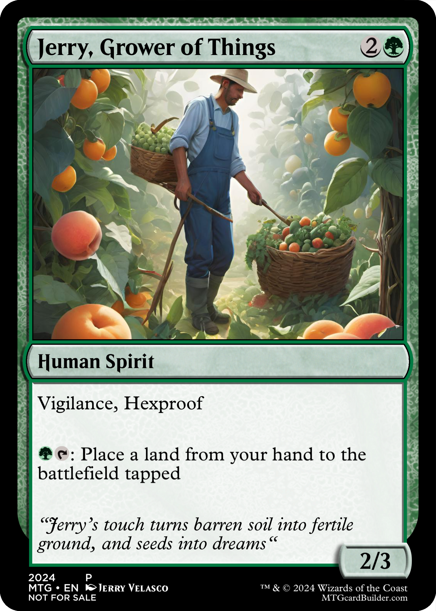
OVERALL: This card reflects my perspective on the world around me. I’m not one to destroy; rather, I thrive on creating connections, meeting fascinating individuals, being inspired by other artists medium, nurturing ideas, observing group discussions unfold, and occasionally tending to my garden. I hold onto hope that the efforts I put into growing something will yield fruitful outcomes for all involved.
GAME ATTRIBUTES: This card’s core function is to allow the player to place an extra land per turn. This will allow the player to grow their resources faster than the other players and eventually allow them to cast more spells over the course of the game.
A link on my website will assist users in comprehending the anatomy of Magic: The Gathering cards. Understanding details will deepen understanding of the cards’ intricacies. Color is huge in the game as it adds depth of personality to cards and play style. A link outside of my website (due to the depth) will shed like on color and color-identity.
Social Links to note:
Facebook: https://www.facebook.com/jerryvelascostudio/
Linked-In: https://www.linkedin.com/in/jerryvel/
Official One Piece Website: https://www.studiof60.com/dean-johnson
The One Piece Show
May 3 – June 29, 2024 (extended an additional month)
Artist Reception First Friday, May 3, 2024 from 6 – 9 p.m.
Schwitzer Gallery at Circle City Industrial Complex (CCIC)
The composite piece with all 18 cards is available for in-person viewing with 50 other artist works at the Schwitzer Gallery at Circle City Industrial Complex (CCIC) through June. It remains unsold and will be off the market at the end of the show on June 30th, 2024. It is priced at $2,000.
