I’ve updated the definitions with a small but meaningful article on UX-UI. Hopefully this will give greater insight on your journey for finding the perfect UX Designer. If its me, Great! If its not, they’re still out there! Keep looking!
300 Views Record Broken in Feb
Move over 300, the new record is now 327.
300 views may seem small to some but for a single individual organically producing web traffic its a big number. 300 is almost 10 views per day. Simply trying to increase traffic is one thing, but being on the job search trail, it makes a huge difference. It allows one to see general page-hit(s). In a job search, filled out applications rarely produce any feedback if you’re not being considered, but web-hits will show data someone is looking at your work. For myself, I’ve been keeping a log since 1/28 when I was really close to breaking the record. I gave up the chance in February due to the 28 day count for the month but February has surprised me!
01/31: I’m current at 261 views and approaching 300 views which my record is 299. I only need 39 more views. This is my last day until views will reset to zero for February which will have 28 days.
02/20: I never made the 300 mark last January but I’m surprised with the 28 day month making huge numbers – Who knew? Once again, I’m excited to see if the site’s traffic can break my old record. Its now at 249 with 8 days to go.
02/21: At 292 for the month – Only 8 views left to go!
02/22: At 299! Completely tied with the record. Just need one person to view. I have 6 days for 1 person.
02/23: Still at 299. I was out Friday and the weekend typically doesn’t generate the same amount of interaction. Shocked that not 1 person in two days has visited my site.
 I’m thinking of testing the Twitter Promote mode in March. It’s $99 for one month. I’d like to think theres research to back my interest, but the explorer in me says, “There’s only one way to understand value of testing but to jump in”. I might add the text hear and continue to post daily or make it a different page/post.
02/25: It took 3 days to get one visitor to just drop by. It must have been someone who’s been here since they directly viewed the food gap page….this pushed my site to the new record of 300. Which means through 2/28, the record could be elevated even higher. I doubt it will go to 400, but lets see what Twitter Promote will do in March? If someone reads this and has done Twitter Promote, I’d be interested in your opinion.
02/26: The number is 318 with 2 days left – 325 or 350 is a possibility.
02/27: 325. For the month of organic posts, this is a good number. If I’m lucky I’ll get 10 more tomorrow.
02/28: 327 this morning. We capped February with new record of 327 for the books.
3/1: Hello Twitter promote mode…Looking forward to seeing how you might change the month of March. (not sure I will post here or post separately)
Starting 2019 Looking for Work

The bee is looking a new hive in 2019.
Several leads have come and gone in 2019 but so far nothing has solidified. New skills to drive this year is software knowledge of Sketch and Zeplin. Besides building screens, Sketch’s ability to do digital prototyping is quick and easy. You can also prototype on actual devices with the Sketch App. An underlying bonus is the nature of staying in a vector format throughout the process.
6 Ways to Avoid the Sin in Easy
[Second in a series of articles and artwork.]
What am I saying? The easy path is the gravy train of all company bottom lines right? Wrong.
Easy is the devil of the largest failures in history. This is not to be confused with ‘Fail Fast‘ concepts. If project deliverables seem too easy, there is a good chance the original estimator missed something or didn’t consult a Subject Matter Expert in that area of expertise. Sometimes risk is removed from projects by removing the estimated variance of unforeseen complications not researched properly.
One of the early symptoms of a bad project, is the path of activities that appear to be easy. This easiness are built into the estimate and make the final bid lower than the competition. Typically an easy task is clouded by some level of ignorance, bad definitions, bad or misused syntax, extra ordinary time pressures and get-r-done mentality.
How many times, have you heard a team members say something like, “That’s an easy fix. It will take 5 minutes.” Afterwards the team-member goes dark and the easy fix ends up becoming an effort that takes days. Ultimately the project timeline bounces around so much that it affects other team members and the burn rate of the budget increases due to the ripple-effects.
#1 English is Code.
The seeds of loss are often sown in the Statement of Work by people who just don’t know how to write a scoping document or they can’t write at all. English is a marvelous language and has all the nuance of a crafty CSS document. English can nest concepts and it can cascade meaning, architecture and properly add timing metrics as well.
Look for words that that do not scope effort. The easy ones are general words that don’t frame a metric type in the document’Any’, ‘All’ are culprits. Watch for words that don’t frame up their effort over time and which make more effort – “The web project will adhere directly to the most up-to-date browsers.” Sounds great but you are promising that the project will be tested for 1-3 browsers during an extended period of time like 8 month or more? Are we included Canary in that mix of browsers?
#2 Don’t copy a copy
Instead of starting with a fresh copy of a scoping document, someone will suggest, for the sake of speed, to simply edit a past project scope document. The copy will usually have been the first approved document but will lack any additional notes or addendum of change in the project – these might be: Change Orders, Budget reports, Scope Shift, etc. When copies are used of past projects, the updates to be successful were never added back to the document typically.
#3: Look for trap words.
These might be typical verbiage or reserved words. Often one will never hear the term easy. The language that is used is hidden as other terminology. ‘Lift and Shift’, ‘Migrate Content’ are a few well used. Some of the bigger projects will say something like ‘We don’t have to worry about that…. the legacy system will pass the calculated variables to the client.” My favorite and the most deadly is “the client will be doing that task so take that off your estimate.”
#4: Avoid Acronyms
Larger companies will mask some of the easy tasks as clever acronyms – do your homework in that industry to understand what you’re nodding your head in agreement. It will also help that you don’t have to ask out loud in a meeting (Yes, I saw that kill our teams reputation before).
The dirtiest and most trending acronym is MVP. No, its not Most Valuable Player, its Minimal Viable Product. Its the bar of profitability and value of the lowest part of the spectrum for success. If you read the link of the definition, it sounds great. At one time it was great when used properly but now it’s sales speak for “Doing the least for the most money.”
#5 – True Double-Checking.
Not just any people, but creators and builders who have worked (or still work) their way through the trenches and who have done that specific kind of work for many years. Watch the switch from effort to budget – they are difference in how salespeople sell but its not how projects are built. When a client asks a salesperson to lower the estimate by 25% it only changes rate, not time, time to create effective products that are properly tested.
#6 – Agile/Waterfall Hybrid Doesn’t work.
The basic Agile methodology and all its variants are wonderful when used properly. When it is used improperly, it becomes a huge mask of over the project. The team should be well-versed in the terminology and cadence of how Agile works or is supposed to work. It helps to have an Agile Coach that isn’t the Project Manager. Choose Waterfall or Choose Agile, but do not attempt to hybrid your process it will not work – Agile is based on small segments of flexible deliverables that can adapt using the backlog correctly. Waterfall is rigid and often requires ‘square shoved in round hole’ moments to meet deadlines.
UX Trends in 2019

Being a UX Designer and Researcher means seeing what’s new and upcoming. As 2018 comes to a close, its a good time to review the future features in-store for UX in 2019.
While a lot of organizations attempt to predict new and intriguing UX Futures, I tend to farm data from multiple sources and so should you. So, while other people are choosing their 4K 80″ TV, I’ve decided to peek into the future and share it with you.
McKinsey Report on Design:
https://www.invisionapp.com/inside-design/mckinsey-report-design/
11 Design Trends to Watch for in 2019
The State of UX in 2019
UX Themes to Wach in 2019
4 Trends that will Shape UX Design in 2019
UX design trends to watch in 2019
Here’s Where UX Is Going in 2019: Top 7 Design Trends
2019 Web Design Trends
UX Design Trends in 2019
New Messaging Work
NEW: I’m always looking for work which is engaging, interesting and spur people to think about their world differently. This work will be integrated into my business cards and become blog posts this quarter.
UPCOMING BLOG TOPICS:
Management Gems: What does it take to be a great manager.
Photo: What makes them hot, dog
Designer: Sign of our times
Executers: Ugly doesn’t work here anymore
Delivery: Understanding the implication of delivery support
Theater: How theatrics play essential roles is business productivity.
 UPDATE: Being busy is great but it steals your time from your own business. I have some spare time and now I’m back to playing with words and images.
Awareness Campaign
I have been a fan of word-play for along time. Over time, I have worked with writers that have inspired me to do more with words & design. I love to see how copy can say two things at once, dynamically invoking a different response in the art and the user impression. Graphically you can’t survive today without invoking some instance using flatness of flat design – I love it. I hope you enjoy this series as much as I did as I created them. Hopefully it might land me some work or employment as well.
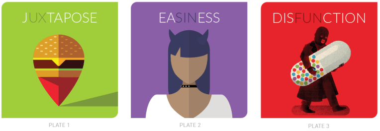
Plate 3: Disfunction:
This is the third in the series where we attempt to understand the middle ground of binary terms. (on-off, win-lose, working-nonworking, black-white) The illustration and wording is exploratory in nature. A support blog can be read for more granularity and approach.
Plate 2: Easiness:
This is a second in series of illustration campaign layouts focuses on how easy tasks will ruin your project. This illustration also has a blog with gives larger context written around the subject.
The series are also being placed in the Facebook and Twitter Ad systems with the same budget. I will add numbers as they are released.
Plate 1: Juxtapose :
UX perspective these days is a variable amount of science without design. The approach of art, design and communication project aligned to patterns of the branding layer is unique. The discovery of unique paths to human behavior is opened by using juxtaposed elements and language.
Sentricon: Appreciated Disgust
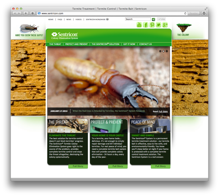
Above: This was the homepage with one photo from the carousel of three images. The basic layout was made to be a convergent approach to messaging from the top-down approach beginning with the homepage. One large image and one message which gets split into 3 diverse messaging channels. (Note: the social icons were not added by me in this screen shot)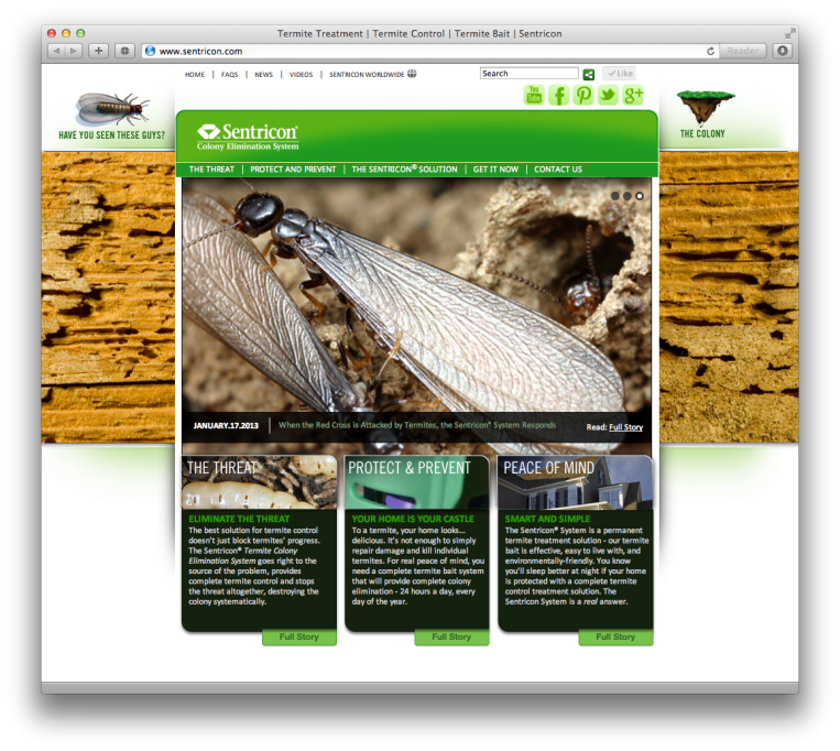
Above: This is the same homepage layout showing another photo. This was an amazing differentiator to the client. The photography was from a distance insect photographer Ph.D. in Entomology; Alex Wilde. His attention to detail and beauty was amazing and unique. I licensed three amazing images for this project to give detail and beauty to something so horrible and destructive to household wood in general.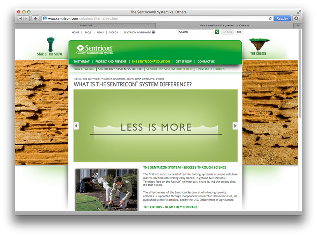
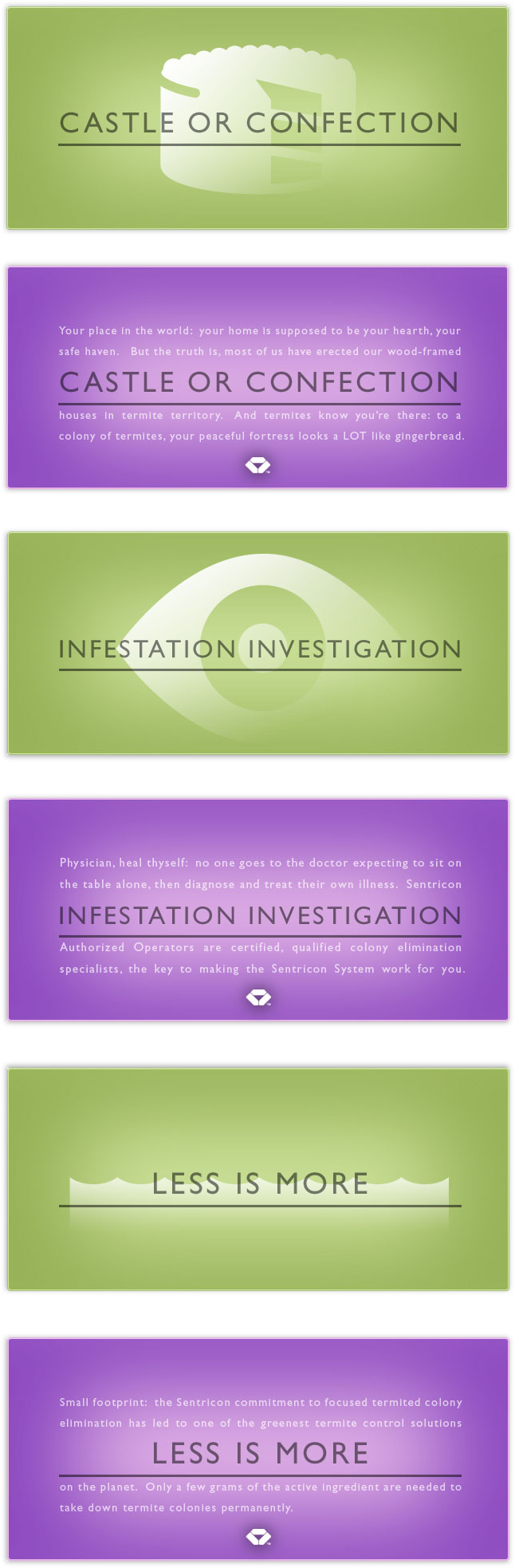
Above: The other strong and effective messaging was the ability to re-direct with objects within the site.
Below: While only one advert-tout is shown above, below you will find 3 of the full 16 of these objects. Each object had a ‘green rest state’ and a ‘purple mouseover state’. All the message objects were basically macro-projects for the website. I worked with a talented writer and roughed out a large amount of content for the website.
Today: This project is one my older but it is one of my favorites. And while I’d like think think the client has long moved on…I will still see these pop up every once in a while.
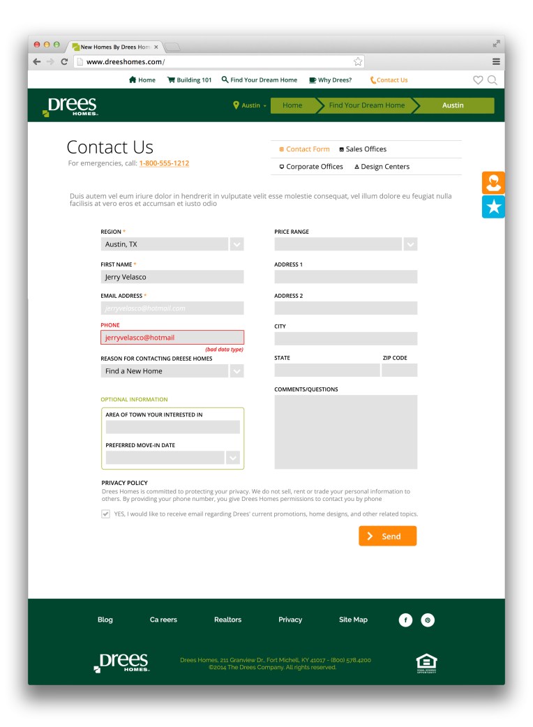
Drees Homes: Web Refresh

Above: This layout was a new way that could be updated over time so as the website could remain fresh for a longer period of time. This was a dynamic shot with an emphasis on amenities of neighborhoods.
General: Drees was needing a better website with a gentle nudge to the future.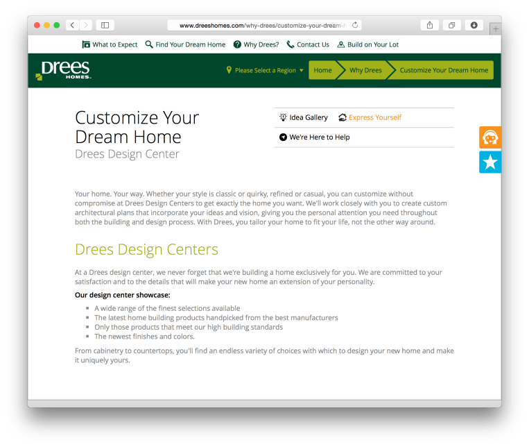
Above: One of the approaches for the design was to really push everything out to be as clean as possible. Use of typography with hinted icons to bring about specificity without clutter. 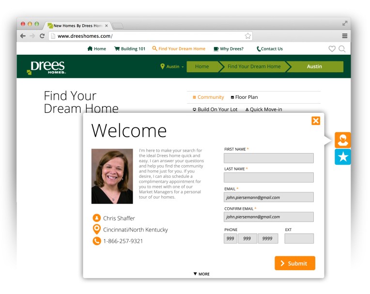
Above: One of the most innovative approaches of effective interaction, was the use of the ‘sticky objects’. These object strategically follow the user without impeding the user journey.
Above: Clean and neat. This is one example of a core design use and application of elegant and clean design.
