UPDATE: I have offered a large list of sticker companies and while they’re all good I have settled on one – Trial is over – Jukebox is a reasonable and decent sticker company to replace your StickerMule needs. They have the same product offerings, shipping and customer service. The Jukebox web address is http://www.jukeboxprint.com – Feb 7th 2026
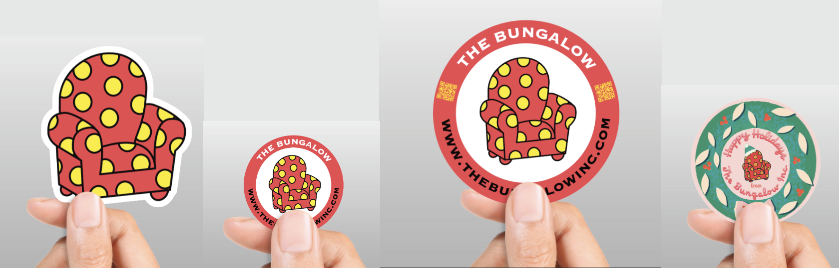
One of my clients needed xmas stickers this year and I tested a new sticker company called Jukebox (jukeboxprint.com). I placed 4 different sticker orders. The process was simple and easy and the price was similar to StickerMule – the only extra thing I had to do was make the outline for the chair die-cut sticker – no big deal. What’s the difference? Not much. I didn’t get a discount for multiple orders and there was no free hot sauce. I also have NOT received any political emails from Jukebox – As the customer, it’s a win-win. The stickers should arrive tomorrow and I will add to this story.
If you boycott Sticker Mule, you might ask yourself, “What companies can I use instead of StickerMule?” Well, Someone (Caspercarr) on Reddit composed a decent list of 22 Sticker Mule-like service companies (see below). I have not vetted the list but we as designers/producers of art should all begin trying these new companies instead of Sticker Mule.
UPDATE: Today, I have found a reasonable and decent sticker company to replace StickerMule. They have the same product offerings, shipping and customer service. The company is called Jukebox (http://www.jukeboxprint.com) – Feb 7th 2026
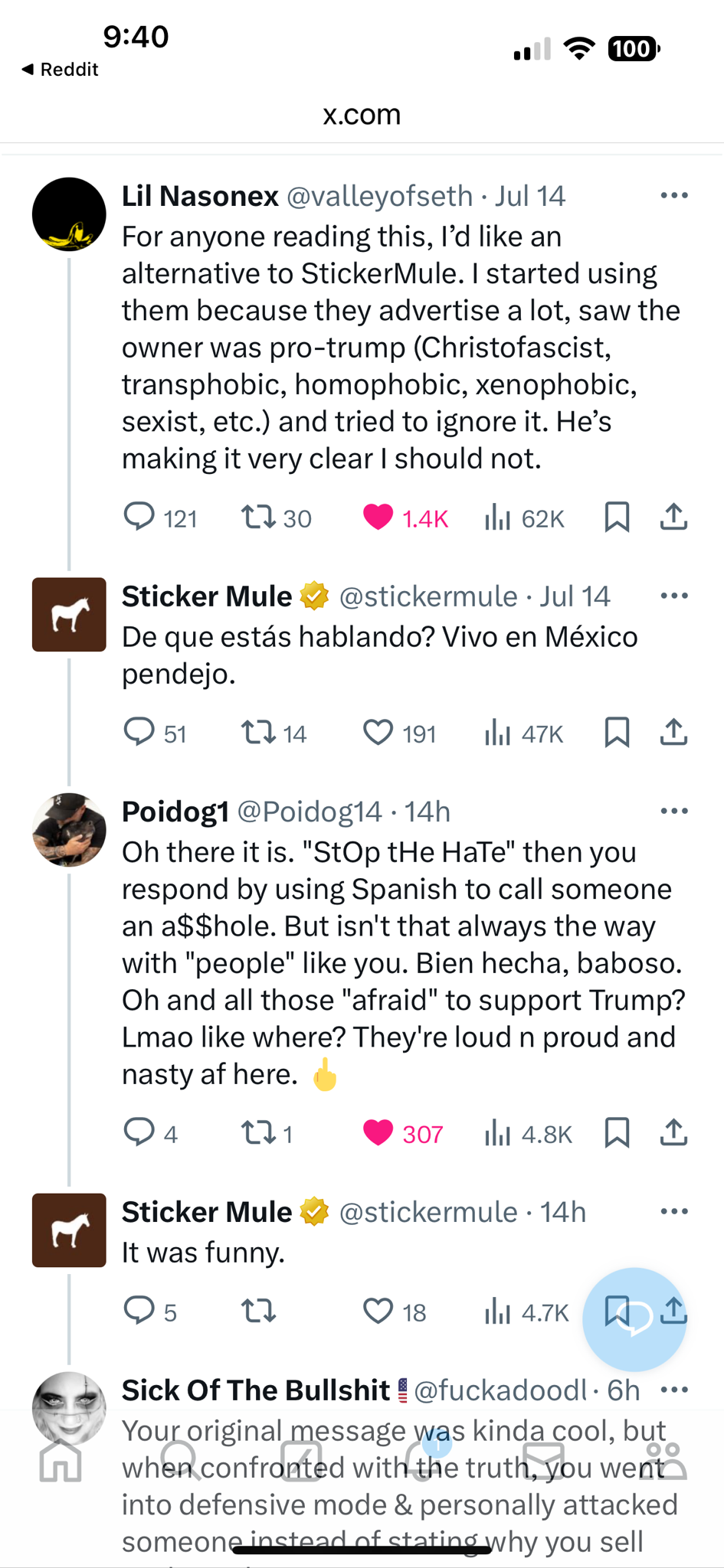
Based on an email (See below) sent today, it’s time to part ways with a printing vendor, Sticker Mule. I assume everyone in their privacy supports whomever they want to, but to use their email platform about hate is wrong – I didn’t sign up for political opinions, it was for product information. I thought companies knew that CUSTOMERS have relationships based on the promises of interaction of BUSINESS, not politics. I even thought it was graphically odd for the company with a mule to be supporting trump. I made Sticker Mule two new logos and a new name that might benefit their new and transparent political alignment. Just when you think it might be an above-board discussion and respectful allegiance, there was a crazy tweet (see below) When does stop the hate meaning calling someone an a$$hole? Really Anthony? Check yourself! You’re too deep in your own hate.
– – – – – Email from Anthony Constantino – – – – – – Hi Jerry,
Donald Trump was shot.
I don’t care what your political views are but the hate for Trump and his supporters has gone too far. People are terrified to admit they support Trump. I’ve been scared myself.Americans shouldn’t live in fear. I support Trump. Many at Sticker Mule do. Many at Sticker Mule also support Biden. The political hate needs to stop. Hopefully this email helps.
Btw, this week, get 1 shirt for $4 (normally $19).
I suggest buying one that shows you support Trump. The more people realize that millions of kind-hearted, compassionate people support Trump, the sooner the hate will end. Awesome people, all over the world, love Trump. Don’t limit your friendships and diminish your happiness by indulging in political hate.
LAST CARD: This is the last card to be added to this page. The amount of writing and development time was considerable in this project – each card was a mini project.
OVERALL: This card was one of the cards printed on metal and contained a QR code. The name Eisheth Zenunium came from an internet search of top popular demon names. This card is from a parallel set of directional series called ‘Jerry Directionals’. This set was similar to UX directionals but the signage was my name instead of UX.
(NEW) AI IMAGERY: This image is one of the top images due to the great composition. Unlike other card images, there is a lot of fire to show the extent and power of the wizard mage. Anytime a figure is emersed in fire without burning, there is a good understanding of the blowback that might be coming your way. The book of Jerry is hot! I needed to photoshop the QR code on the Jerry book. I was pleased that the QR codes work when reversed out of imagery. My only nit is the armor shine is rather white considering the amount of flame surrounding the figure but the white highlights do bring more focus to the figure.
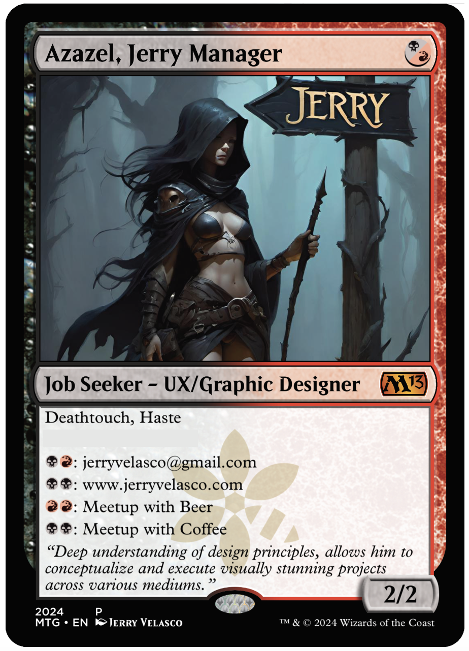
OVERALL: The second to the last card for the full series. The name Azalea came from an internet search of top popular demon names. This card is from a parallel set of directional series called ‘Jerry Directionals’. This set was similar to UX directionals but the signage was my name instead of UX.
(NEW) AI IMAGERY: The background is in a gloomy forest, only light appears to be natural canopy lighting. Unlike other signs, this one has an arrow shape to it. The leather-clad figure seems like a wizard being there is no apparent sharp weapons – the stave has a pointed tip but the figure doesn’t appear dressed for combat. Most interesting feature in the composition is the lighting on the figure – well placed shadows accent the attributes of the figure. I held back an urge to add glowing eyes. The slight flowing wind is shown in the hair and cape. It’s also interesting that she appears to be walking away from the signs direction but she’s my rep and doesn’t need to be near me if she’s out representing me. Overall there is a lot of mystery in this composition which is why I really enjoyed it.
OVERALL: This card is from a set of directional series called ‘UX Directionals’. Where the main figure is holding signage.
(NEW) AI IMAGERY: This image was chosen for the overall dark elements. The typical iconic knight is shrouded in darkness and dark metal armor. The figure is facing away from us showing their backside. The silhouette wonderfully depicts the sharp outlines of the armor. Armor highlights hint of a well lit canopy. The background is odd being it has some indoor/outdoor elements. There is a hint of a fire light in the lower right corner and warm highlights on the lower-right area of the knight. The signage design appears custom made for the armor. The UX font and color are the color-cool elements in the composition making it stand out amongst the overall gloomy composition.
OVERALL: The name Lamia came from an internet search of top popular demon names. This card is from a parallel set of directional series called ‘Jerry Directionals’. This set was similar to UX directionals but the signage was my name instead of UX.
(NEW) AI IMAGERY: Overall great composition with a lot of subtle work going on. The figure and the sign compete for attention in this layout. The AI created the Jerry Sign really huge, more like a billboard. The font for Jerry was crazy and odd. Its seems to have created each letter separately – look at the two R’s. The structure of the sign is very dark yet Flintstone in design. The color-choice of red for the lettering makes Jerry really stand out. The background is outside and lighter than the other dark forest imagery created by AI. The figure has no armor but appears to have razor sharp Demi-gaunts. The figures hair is swooping not sure if it’s wind or scary magical hair that will kill me. The figure is also holding large dagger which is cropped out.
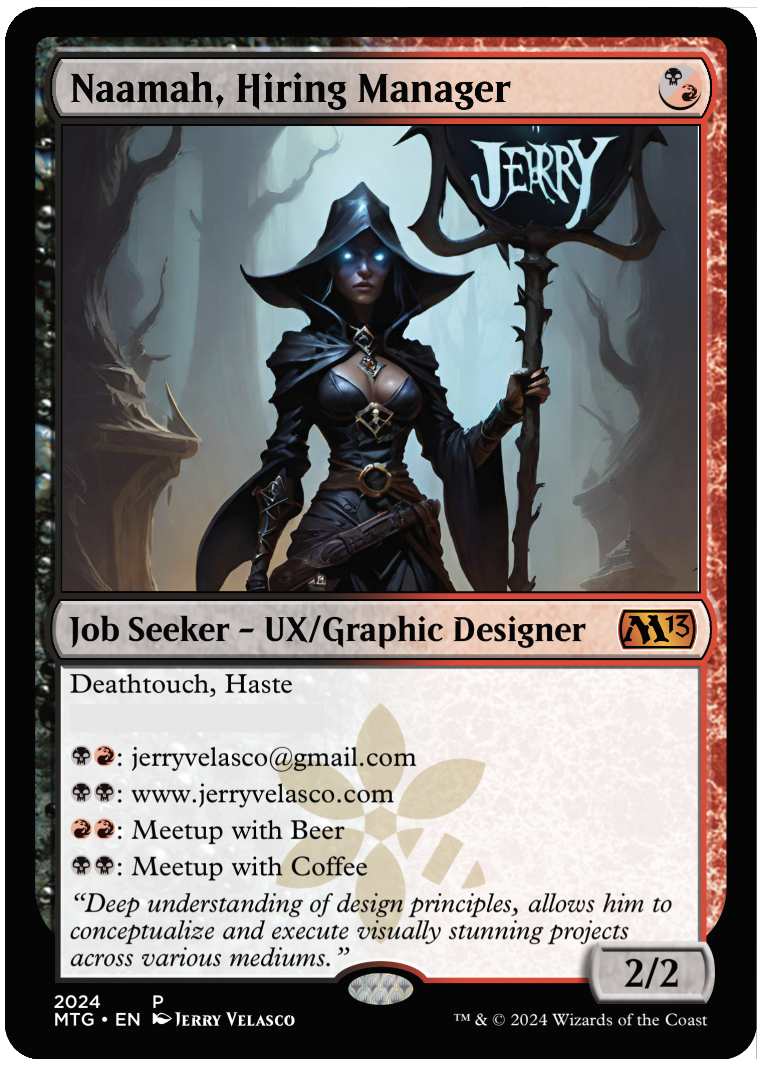
OVERALL: The name Naamah came from an internet search of top popular demon names. This card is from a parallel set of directional series called ‘Jerry Directionals’. This set was similar to UX directionals but the signage was my name instead of UX.
(NEW) AI IMAGERY: Background is great – blueish, dark forest, very gloomy with a small amount of warm lighting on the bottom left to indicate a fire nearby. The backlighting gives contrast to the figure and really defines the edges to the figure and the signage. The glowing eyes of the warlock make the scene complete. The crazy ornamentation of the sign is really cool visually by the somewhat spiky and organic sign design. The font is crazy weird and looks like magic created it. Overall a really nice composition for a leave-behind card.
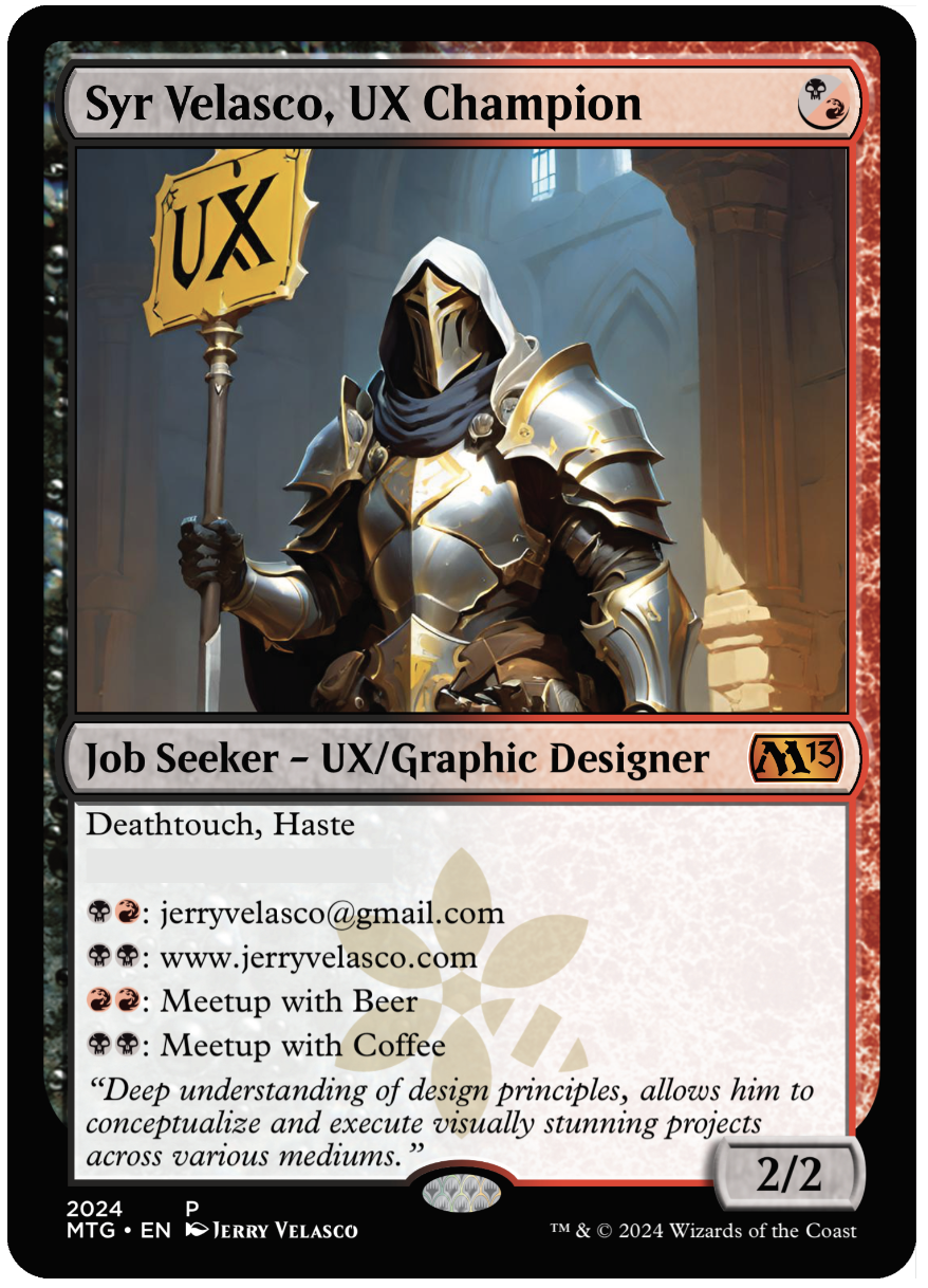
OVERALL: This card is from the UX Design series called ‘UX Directionals’.
(NEW) AI IMAGERY: This composition made it to the ‘print round’ due to the fact that the figure is a traditional white Paladin. The figure is iconic and makes for a solid fantasy position in imagery. Great traditional image to hand out as a business card. The light and shiny armor with gold trim work well for executive security for high government officials. The sign is bright with black UX lettering. The background is placed inside a castle or church. The shadowing is great and cuts the paladin down the middle.