Azazel, Jerry Manager

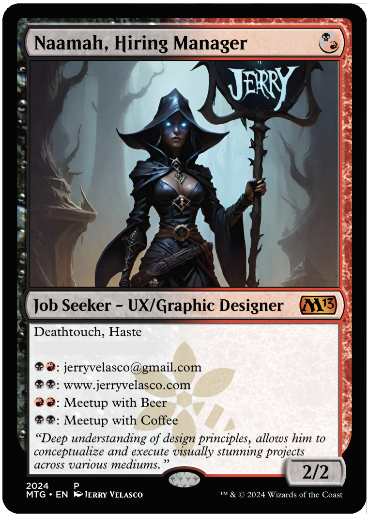
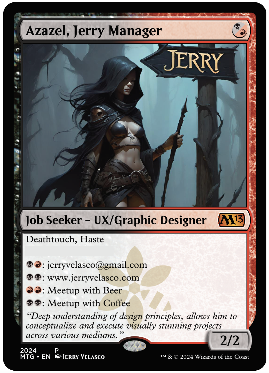
OVERALL: The second to the last card for the full series. The name Azalea came from an internet search of top popular demon names. This card is from a parallel set of directional series called ‘Jerry Directionals’. This set was similar to UX directionals but the signage was my name instead of UX.

(NEW) AI IMAGERY: The background is in a gloomy forest, only light appears to be natural canopy lighting. Unlike other signs, this one has an arrow shape to it. The leather-clad figure seems like a wizard being there is no apparent sharp weapons – the stave has a pointed tip but the figure doesn’t appear dressed for combat. Most interesting feature in the composition is the lighting on the figure – well placed shadows accent the attributes of the figure. I held back an urge to add glowing eyes. The slight flowing wind is shown in the hair and cape. It’s also interesting that she appears to be walking away from the signs direction but she’s my rep and doesn’t need to be near me if she’s out representing me. Overall there is a lot of mystery in this composition which is why I really enjoyed it.

Syr Velasco, UX Champion

OVERALL: This card is from a set of directional series called ‘UX Directionals’. Where the main figure is holding signage.

(NEW) AI IMAGERY: This image was chosen for the overall dark elements. The typical iconic knight is shrouded in darkness and dark metal armor. The figure is facing away from us showing their backside. The silhouette wonderfully depicts the sharp outlines of the armor. Armor highlights hint of a well lit canopy. The background is odd being it has some indoor/outdoor elements. There is a hint of a fire light in the lower right corner and warm highlights on the lower-right area of the knight. The signage design appears custom made for the armor. The UX font and color are the color-cool elements in the composition making it stand out amongst the overall gloomy composition.

Naamah, Hiring Manager

OVERALL: The name Naamah came from an internet search of top popular demon names. This card is from a parallel set of directional series called ‘Jerry Directionals’. This set was similar to UX directionals but the signage was my name instead of UX. 

(NEW) AI IMAGERY: Background is great – blueish, dark forest, very gloomy with a small amount of warm lighting on the bottom left to indicate a fire nearby. The backlighting gives contrast to the figure and really defines the edges to the figure and the signage. The glowing eyes of the warlock make the scene complete. The crazy ornamentation of the sign is really cool visually by the somewhat spiky and organic sign design. The font is crazy weird and looks like magic created it. Overall a really nice composition for a leave-behind card.

Experience Tactician

OVERALL: This card was 1 of 2 which were printed on ‘metal’ instead of paper. While this card was designed for the handout series, it was not intended to be given away, instead the potential meetup would scan the QR code. This card is from the UX Design series called ‘UX Directionals’. These were created to show the focus of UX by having a fantasy character hold a UX sign. I didn’t note this earlier, but the ‘leave behind’ series also is differentiated by my logo where magic ‘faction’ watermark resides on normal Magic cards. My logo on a green background is on the back (see image below).

(NEW) AI IMAGERY: This image conveys the sour and desperate methods in which looking for a job is such a horrible process. The grim corpse-like figure holding up the link to their resume or website peddling his want for employment on the street. What a pathetic existence this poor fellow must have in his life. When will he hear back from any anyone? The sunken frowning face depicts the pain and sorrow associated with rejection in a process that offers no reasons for the situation he is now a part of.

Hecate, UX Harpy Resources

OVERALL: I had fun with the name swapping ‘Human Resources’ with ‘Harpy Resources’. Hecate is one of the top 10 popular female demon names. This UX directional is from the spicy side of AI production. Typically for this project, I did no photoshopping but on this image, I did have to fix the eyes. This card is from the UX Design series called ‘UX Directionals’. These were created to show the focus of UX by having a fantasy character hold a UX sign. I didn’t note this earlier, but the ‘leave behind’ series also is differentiated by my logo where magic ‘faction’ watermark resides on normal Magic cards. My logo on a green background is on the back (see image below).

(NEW) AI IMAGERY: The lighting is good and the mood was dark and scary. The overall color palette is bluish avoiding any warm colors at all. The figure is somewhat attractive and scary at the same time. The figure is adorned in light-pointed-battle-armor. The horns are a bonus – really made a good impression by contrasting with the lighter part of the background. The signage is odd and the fonts don’t match but double-pumping UX is helpful for leave-behind material. AI prompting is somewhat experimental and a journey of finding the image you want. I was impressed with the overall composition amongst the 30+ image renders.

GAME ATTRIBUTES: This card wasn’t design to be played – it was to be used as a business card during the event. I wouldn’t recommend playing this card but if you had to, this would be a 2/2 creature with death touch and haste. It would be a good 1 mana play on turn 1. The in-game mana abilities wouldn’t help during the game at all unless you were playing me and I might have to leave to meet with you during a game and lose the game out of forfeit.

Syr Velasco, UX Champion

OVERALL: This is from the UX Design series called ‘UX Directionals’. These were created to show the focus of UX by having a fantasy character hold a UX sign. There was some spicy cards and some less-spicy cards – this was one of the less-spicy images as the figure is completely covered in armor. Syr is a knight pre-fix neuter version Sir. Creature is me, the job seeker UX Designer / Graphic Designer. As of this post, I am still seeking employment.

[I’m adding a new section below as it will be the differentiating factor of the leave-behind cards. The game attributes won’t change from card to card.]

AI IMAGERY: AI prompting is somewhat experimental and a journey of finding the image you want. I was impressed with this composition. The lighting is good and the mood was dark and scary. The highlights on the armor indicate a small village of perhaps a fire near the figure. The sign shape had a fantasy shape with sharp edges. Knights are considered good agents generally, however this one appears more of a dark nature. The silhouette creates a good number of sharp edges to the armor. The UX font color was red which aligned to the color identity of the card itself.

GAME ATTRIBUTES: This card wasn’t design to be played – it was to be used as a business card during the event. I wouldn’t recommend playing this card but if you had to, this would be a 2/2 creature with death touch and haste. It would be a good 1 mana play on turn 1. The in-game mana abilities wouldn’t help during the game at all unless you were playing me and I might have to leave to meet with you during a game and lose the game out of forfeit.

Lilith, Hiring Manager

OVERALL: I wanted to be able to have cards that I could hand out at the event. This magic card is basically a business card with use for mana-based connection possibilities. I found a listing of the most popular demon names and applied a unique name to the card. Some are more spicy than others, so I had to make a set of non-spice for each spicy version – I didn’t want to offend anyone.

GAME ATTRIBUTES: None intended, but it can run in a game as a 2/2 creature with deathtouch and haste.