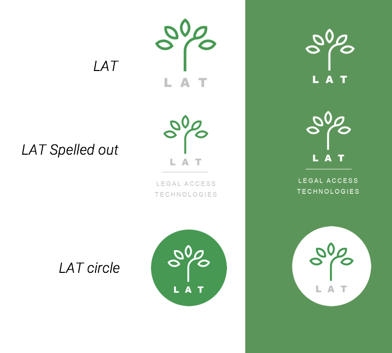
This assignment was for a start-up legal firm, Legal Access Technologies (LAT), which produces software for the legal community. Working with lawyers was interesting. It was a large step which needed some push and explanation of the design reasoning behind visual decisions.
The logo direction was meant to have a strong movement of ‘growth’. Green was the obvious color of choice – which isn’t a typical law color. While the full name Legal Access Technology was accurate, it seemed long and soon the internal group was using the term LAT. I positioned the use of the acronym as a method to convey simplicity. There are marks which have the full name but only on documentation that is for first-encounter channels.
Being a start-up, I wanted to be cost conscious. The dominant single color was green and could easily work in single color applications easily. There was a 2 color version with the type in grey as to keep color focus on green (growth).