This was a large website re-haul from top to bottom. The United Healthcare project started in the early part of the year with a deadline for launch in time for the new health exchange open enrollment. My role was making sure the design was responsive and brand supportive. I also had to build out my concepts for the CMS coders and programmers to develop according to a atomic/modular approach.
Layout with Behavior-Points
Besides designing the layout at a high fidelity, I wanted to be sure that any interaction on the page was designed with reusable behavior patterns. The homepage layout below is chock-full of detail as well as documentation that deeply discussed the interaction-load to be designed for outside of this document.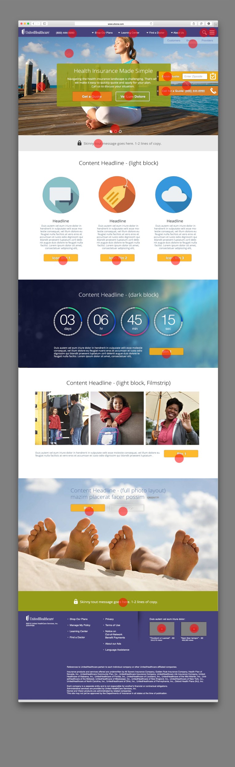
Object Identification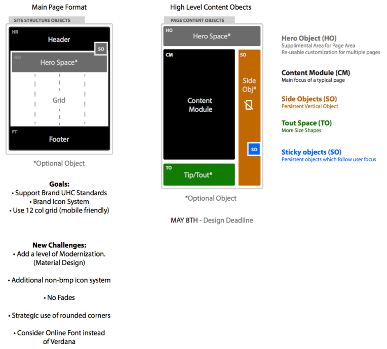
Reserved Color System
Respecting brand colors as it directly relates to website navigation color is important. Laying out specific color usage for specific objects made the site work great as UX/Branding synergistic approach.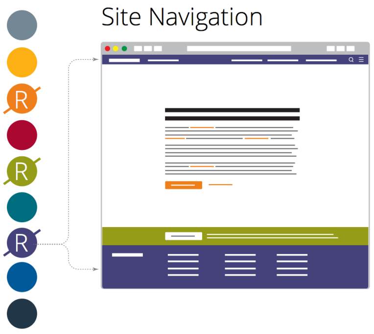
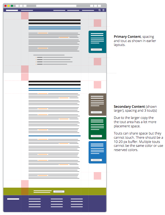
Content Patterning Analysis
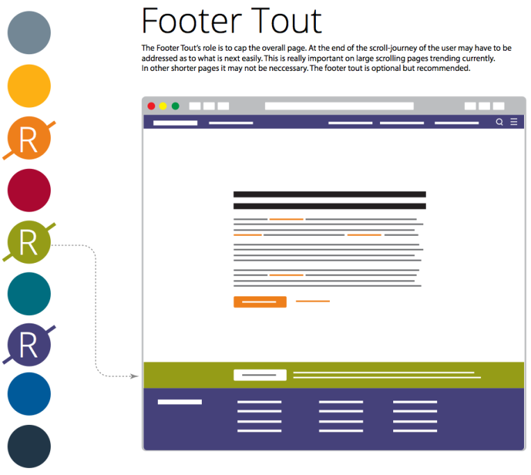
Another successful work product was the ability to forecast patterns of content as it was consumed from the CMS database. These diagrams were instrumental in helping set rules so content and touts could have harmonic patterns that directly relate to CMS modules and content sizing.