This client was moving from their first start-up website. With this next website, the care and deliberate approach was to align the style to their core business philosophy; the art of chocolate making is a unique experience and human-artist produced. The client was very french and most chocolate was hand-made and hand-painted. Their target market was shifting to hit some of the higher-end chocolate products while avoiding mass-production of chocolate products.
Robust Approach
This approach was going to highly interactive with a depth of photography of their product that aided the site by keeping elements more visual. Basically everything would grow from the homepage. The elements would be poking underneath the clean space. When the user would interact with an element (like the bottle) the element would push down and move the viewer down a bit and open up content based on the interaction. The bottle represented alcohol pairing for their chocolate products.

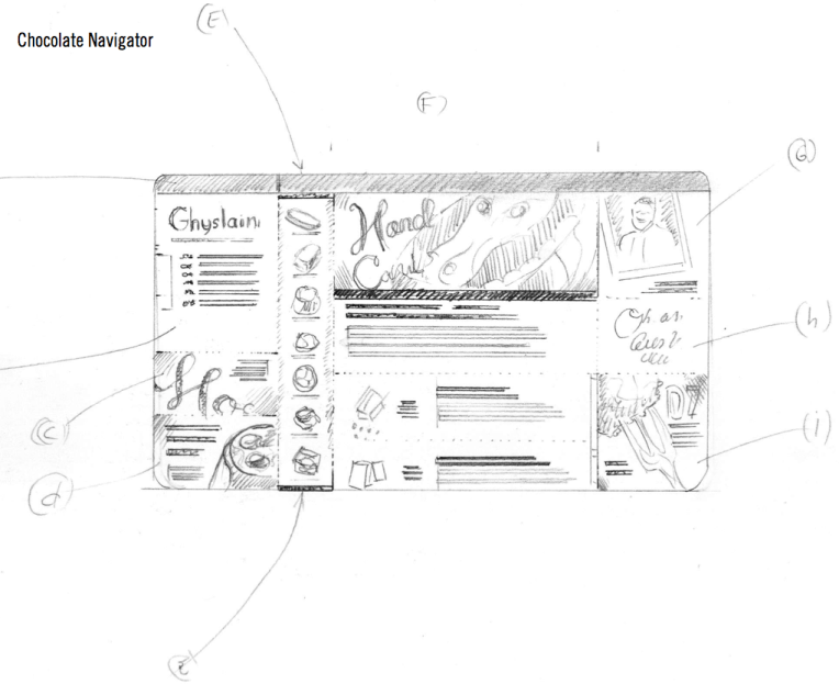
Chocolate Navigator
This layout was showing more navigation build from left to right. The basis for this design was more structure but foundational would be all about their chocolate product. Instead of simply listing products, the Chocolate Navigator would resemble more of as a Chocolate Library Scheme or a Taxonomy of Chocolate.